iOS App Development
SwiftUI Thinking
May 16, 2024
If you are looking for a starting point for SwiftUI, you are at the right place!
Common View Components and Their Properties
Similar to UIKit, some of the most used UI components exist in SwiftUI.
Text
Text is equivalent to UILabel.Text(“Hello World!”)
.font(.title.bold())
.foregroundStyle(.blue)

Button
As you guessed, Button is equivalent to UIButton.Button {
print(“Button Action”)
} label: {
Text(“Hello World!”)
.font(.title.bold())
.foregroundStyle(.white)
.padding()
.background(.blue)
.clipShape(RoundedRectangle(cornerRadius: 16))
}

Image
As you might expect, Image is equivalent to UIImageView.Image(systemName: “house.fill”)
.resizable()
.scaledToFit()
.foregroundStyle(.blue)

TextField
TextField equals to UITextField.TextField(“placeholder”, text: .constant(“”))
.textFieldStyle(.roundedBorder)

HStack & VStack
When it comes to structuring the UI of your app, it’s essential to align views with one another.
In SwiftUI, there are two primary layout builders for this purpose: HStack and VStack.
These layout builders allow you to arrange views horizontally and vertically, respectively.
You can also combine them to achieve more complex layouts.
HStack
HStack aligns views horizontally.HStack {
Text(“Leading Text”)
.font(.body.bold())
.foregroundStyle(.blue)
Text(“Trailing Text”)
.font(.caption.bold())
.foregroundStyle(.orange)
}

VStack
It aligns views vertically.VStack {
Text(“Top Text”)
.font(.body.bold())
.foregroundStyle(.blue)
Text(“Bottom Text”)
.font(.caption.bold())
.foregroundStyle(.orange)
}

Relationship Between Views: Flexible UI with Spacer
Spacer is SwiftUI’s light but powerful component to build flexible UI.
As you’re aware, aligning one view to another using constant margins (leading, top, trailing, bottom) can be overly cumbersome.HStack {
Text(“Leading Text”)
.font(.body.bold())
.foregroundStyle(.blue)
Spacer()
Text(“Trailing Text”)
.font(.caption.bold())
.foregroundStyle(.orange)
}

When a Spacer is placed between two Texts in an HStack, it naturally pushes the Texts towards the edges as it is designed to do.HStack {
Spacer()
Text(“Leading Text”)
.font(.body.bold())
.foregroundStyle(.blue)
Spacer()
Text(“Trailing Text”)
.font(.caption.bold())
.foregroundStyle(.orange)
Spacer()
Spacer()
}
I add one more Spacer before the Leading Text and two more Spacers after the Trailing Text.

When adding Spacers, the Leading Text is pushed away from its leading edge by one Spacer, while the Trailing Text is pushed away from its trailing edge by two Spacers.
As a result, the Trailing Text ends up farther away from the device edge compared to the Leading Text.
Working with Data List
Regarding the data list, SwiftUI has two options, List or Foreach.
List
List equals to UITableView in UIKit.var numbers = [1, 2, 3, 4, 5]
List(numbers, id: \.self) { number in
Text(“\(number)”)
}

This is pure simple!
List also has some prepared UI such as divider, card-looking, etc.
Foreach
var numbers = [1, 2, 3, 4, 5]
VStack {
ForEach(numbers, id: \.self) { number in
Text(“\(number)”)
}
}

The Foreach construct offers a leaner alternative to the List component. With Foreach, you have full control over building your list UI, resulting in a simpler and more customizable approach.
Updating UI with Observable Property
SwiftUI differs from UIKit by embracing the Declarative Programming approach.
In Declarative Programming, the UI observes changes in an Observable value or property.
Whenever the value changes, the UI dynamically adjusts to reflect the change.
SwiftUI’s fundamental property wrappers, State and Binding, enable observability:
State: Facilitates a one-way connection and is primarily used within the associated view.
Binding: Establishes a two-way connection and is utilized to transmit State properties to another view.
For now, let’s focus on only the State
@State var text: String = “Initial Text”
VStack(spacing: 32) {
Button {
text = “Edited Change”
} label: {
Text(“Change Text”)
.font(.title.bold())
.foregroundStyle(.white)
.padding()
.background(.blue)
.clipShape(RoundedRectangle(cornerRadius: 16))
}
Text(text)
.font(.body.bold())
.foregroundStyle(.blue)
}

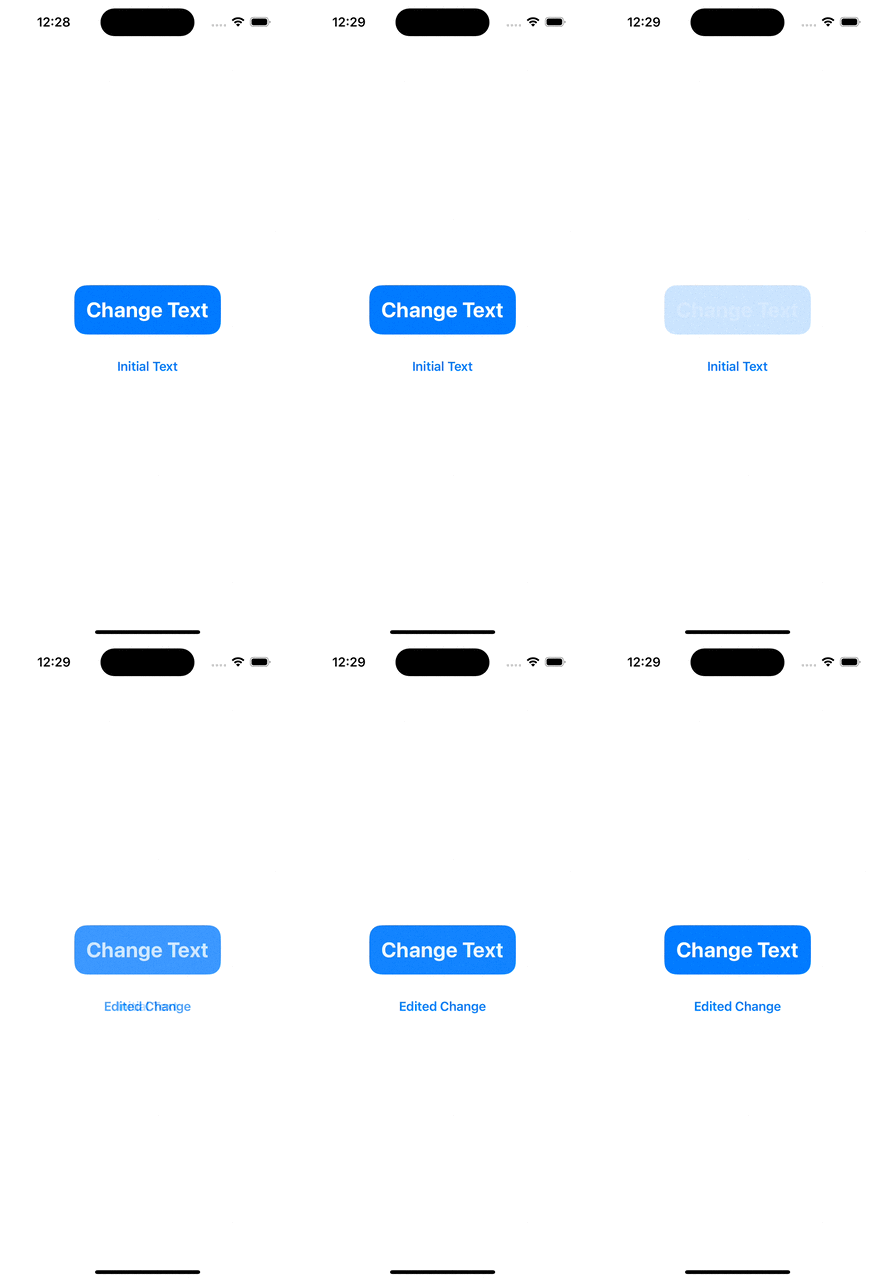
The Change Text button action modifies the observable text property. As the UI is designed to listen to changes in the text property, it automatically updates itself. This functionality is made possible by the State property wrapper.
View
Every SwiftUI view is a struct that conforms to the View protocol.
Since structs do not allow class inheritance, SwiftUI views can only conform to protocols.
These characteristics necessitate adopting an approach that views in SwiftUI are standalone and unique.
In UIKit, it is common practice to create base classes for specific views like UIViewController and UITableViewController. While it may be challenging to break away from this habit, it is possible with a shift in mindset!
Useful Components
One of SwiftUI’s core principles is less code, more work.
There are some ready-to-use view components to make development easier.
Label
It is a mix of Image and Text in an HStack.Label(“I am a Label”, systemImage: “house.fill”)

Picker
It is a combined version of UISegmentedControl and UIPickerView.
It has various styles such as wheel, inline, segmented, and palette.let numbers = [1, 2, 3, 4, 5]
@State var selection: Int = 0
Picker(“Select”, selection: $selection) {
ForEach(numbers, id: \.self) { number in
Text(“\(number)”)
}
}
.pickerStyle(.inline)

Image Scale
Since SwiftUI’s inception, Apple has provided its image library, SF Symbols. You can effortlessly access these images from the library using the Image view.
Additionally, you have the flexibility to scale the image using the font function, similar to setting the font for a Text view.Image(systemName: “house.fill”)
.font(.largeTitle)
SwiftUI is a new way to develop projects in Apple’s environment.
You somehow adapt your thinking to SwiftUI’s way.
Once you can do that, the doors of SwiftUI will be open totally for you!
Author: Yusuf Demirci


