For many years, Android versions have carried dessert names — Cupcake, Donut, Oreo… But the old alphabetical tradition has now been set aside. Calling Android 16 “Baklava” is both a nostalgic nod and a salute to our local culture, spotlighting the world-famous Turkish pastry. 🙂
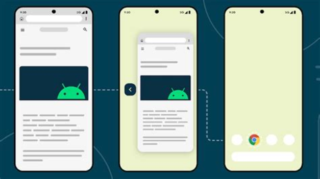
Predictive Back Updates
When the user swipes to go back, the screen doesn’t just disappear instantly. Instead, Android shows a smooth transition using animations like fade-out or slide, depending on where the system knows you’re going back to. This makes the experience feel more natural. You can also add your own custom back animations without breaking the regular onBackInvoked flow.
onBackInvokedDispatcher.registerOnBackInvokedCallback(
  PRIORITY_SYSTEM_NAVIGATION_SERVER,
  OnBackInvokedCallback {
    binding.root.animate().alpha( 0f ).setDuration( 150 )
      .withEndAction { supportFragmentManager.popBackStack() }
  }
)

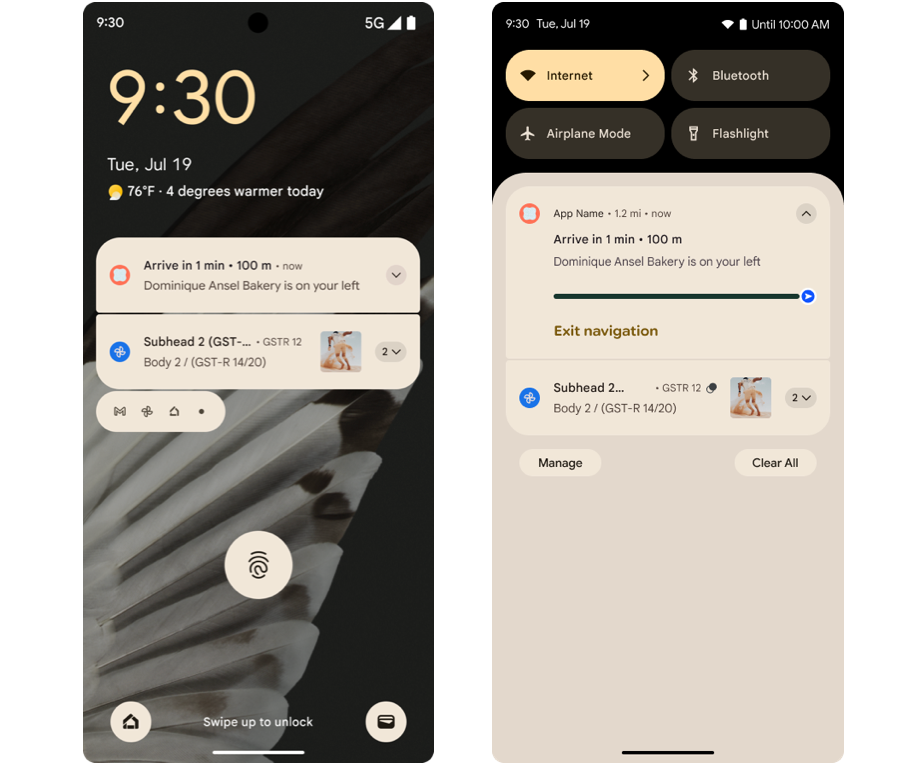
This feature helps you make your notifications more informative by showing the whole “start-to-end” process. So, for long tasks like downloads, delivery tracking, or navigation steps, users can clearly see which stage they’re in. With points and segments, you can highlight key moments and phases, making everything more predictable.
var ps =
    Notification.ProgressStyle()
        .setStyledByProgress( false )
        .setProgress( 456 )
        .setProgressTrackerIcon(Icon.createWithResource(appContext, R.drawable.ic_car_red))
        .setProgressSegments(
            listOf(
                Notification.ProgressStyle.Segment( 41 ).setColor(Color.BLACK),
                Notification.ProgressStyle.Segment( 552 ).setColor(Color.YELLOW),
                Notification.ProgressStyle.Segment( 253 .setColor(Color.WHITE),
                Notification.ProgressStyle.Segment( 94 ).setColor(Color.BLUE)
            )
        )
        .setProgressPoints(
            listOf(
                Notification.ProgressStyle.Point( 60 ) ).setColor(Color.RED),
                Notification.ProgressStyle.Point( 560 .setColor(Color.GREEN)
            )
        )
It gives you full control over the frequency and amplitude curves of the haptic actuator. You can create complex vibration patterns like “short-long-short” to match different actions. This helps you deliver consistent haptic feedback across devices from explosions in games to subtle confirmation taps on forms.
val pattern = longArrayOf( 0 , 60 , 40 , 120 )
val amplitudes = intArrayOf( 0 , 180 , 0 , 255 )
val effect = VibrationEffect.createWaveform(pattern, amplitudes, - 1 )

vibrator.vibrate(effect)
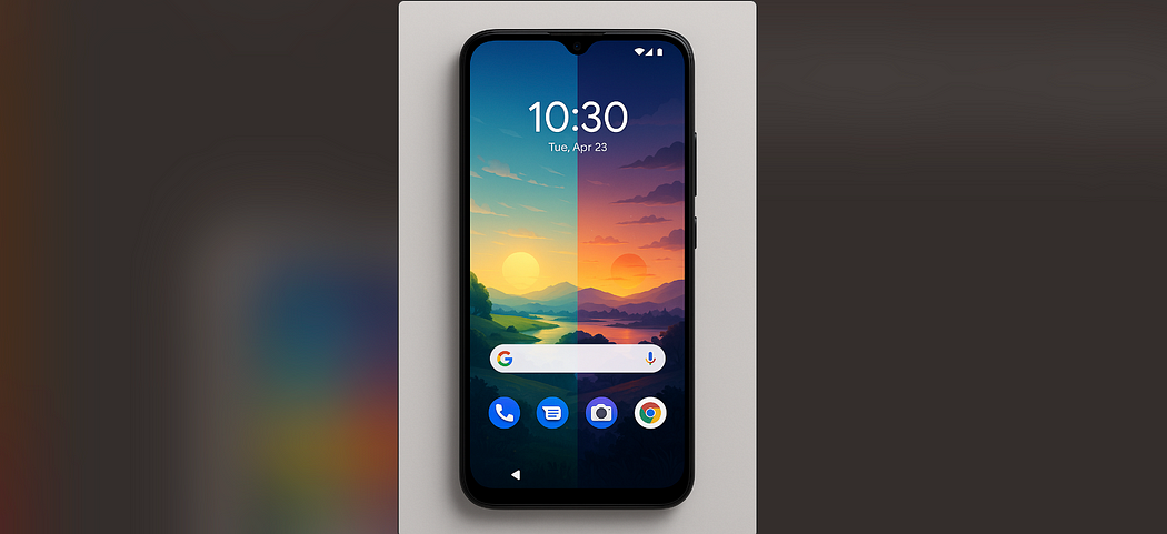
With WallpaperDescription and WallpaperInstance, you can define separate metadata for each live wallpaper variant, like lock screen or home screen. This makes it easier to assign different content to each one from the same wallpaper service. The picker UI also gets this metadata so users can select personalized versions more easily.
val desc = WallpaperDescription.Builder()
    .setId( "sunrise" )
    .setTitle( "sun" )
    .setDescription(listOf( "" ))
    .setThumbnail(sunriseThumbUri)
    .setContextDescription( "Settings" )
    .setContextUri(Uri.parse( "app://settings/sunrise" ))
    .build()

val info = WallpaperManager.getInstance(ctx).getWallpaperInfo()
val instance = WallpaperInstance(info, desc)
WallpaperManager.getInstance(ctx)
    .setWallpaperInstance(instance, WallpaperManager.FLAG_SYSTEM)
Starting from Android 15, ProfilingManager can automatically trigger trace recordings during critical moments like cold starts or ANRs. Since the system handles when to start and stop tracing, it’s easier to capture important flows and integrate profiling into your CI/CD pipeline. All trace files are saved in your app’s data folder for analysis.
val pm = getSystemService(ProfilingManager::class.java)
pm.addProfilingTriggers(
    ProfilingManager.TRIGGER_COLD_START or ProfilingManager.TRIGGER_ANR
)
Introduced in Android 15, the getStartComponent() method clearly tells you what triggered your app launch — was it the launcher, a widget, a notification, or a service? Based on this info, you can change the screen or animation shown. It’s helpful for improving diagnostics and startup flow.
val startInfo = ApplicationStartInfo.getInstance(applicationContext)
val componentType = startInfo.getStartComponent() {
     ApplicationStartInfo.START_COMPONENT_ACTIVITY -> {
        navigateToHomeScreen()
    }
    ApplicationStartInfo.START_COMPONENT_BROADCAST_RECEIVER -> {
        navigateToReceiverHandledScreen()
    }
    ApplicationStartInfo.START_COMPONENT_SERVICE -> {
        navigateToServiceResultScreen()
    }
    ApplicationStartInfo.START_COMPONENT_UNKNOWN,
    değilse -> {
        navigateToDefaultScreen()
    }
}

New in Android 16, getPendingJobReasons(jobId) shows a list of reasons why a scheduled job is still pending whether it’s due to system restrictions or developer-defined constraints. You can also get the recent change history using getPendingJobReasonsHistory(). This helps you debug delays or failures in JobScheduler tasks.
// 1. Get JobScheduler instance
val jobScheduler = context.getSystemService(JobScheduler:: class .java)
// 2. Get the pending reasons for the job
val reasons: List< Int > = jobScheduler.getPendingJobReasons(MY_JOB_ID)
// 3. Check and log each reason
if (reasons.isEmpty()) {
    Log.d( "JobDebug" , "Job can be run immediately." )
} else {
    reasons.forEach { reason ->
        when (reason) {
            JobInfo.PENDING_JOB_REASON_BATTERY_SAVER_ENABLED ->
                Log.w( "JobDebug" , "Battery saver mode enabled" )
            JobInfo.PENDING_JOB_REASON_DEVICE_IDLE ->
                Log.w( "JobDebug" , "Device is in Doze mode" )
            JobInfo.PENDING_JOB_REASON_REQUIRE_CHARGING ->
                Log.w( "JobDebug" , "Requires charging" )
            JobInfo.PENDING_JOB_REASON_REQUIRE_UNMETERED_NETWORK ->
                Log.w( "JobDebug" , "Requires unmetered network (Wi-Fi)" )
            // ... other constants
            else ->
                Log.w( "JobDebug" , "Pending reason code: $reason " )
        }
    }
}
// 4. If you want to review the history of pending reasons
val history: List<PendingJobReason> =
    jobScheduler.getPendingJobReasonsHistory(MY_JOB_ID)
history.forEach { entry ->
    Log.d( "JobHistory" , " ${entry.timestamp} : reason= ${entry.reason} " )
}
From Android 15, you can use hasArrSupport() and getSuggestedFrameRate() to adapt your app’s frame rate smoothly (e.g., to 60Hz, 90Hz, etc.) on supported devices. The method getSupportedRefreshRates() also returns, letting you list all possible refresh rates and choose the best one.
// 1. Get the view's SurfaceControl host
val host = myCustomView.host
// 2. Verify that adaptive refresh rate is supported
if (host.hasArrSupport()) {
    // 3. List all supported refresh rates (e.g. [60.0, 90.0, 120.0, 144.0])
    val rates: FloatArray = host.supportedRefreshRates
    Log.d( "ARR" , "Supported rates: ${rates.joinToString()} " )
    // 4. Ask the system for the best rate close to 60 fps
    val optimalFps: Float = host.getSuggestedFrameRate( 60f )
    // 5. Apply this frame rate to your view for smoother rendering
      host.setFrameRate(optimalFps)
}
In Android 16, you can now check how much free CPU and GPU power your device has using SystemHealthManager.getCpuHeadroom() and getGpuHeadroom(). You can also set parameters like time window or stat type using CpuHeadroomParams and GpuHeadroomParams to dynamically adjust quality during thermal throttling.
val shm = getSystemService(SystemHealthManager::class.java)
val params = CpuHeadroomParams.Builder()
    .setDurationMillis(500)
    .setStatType(CpuHeadroomParams.STAT_TYPE_AVERAGE)
    .build()
val cpuHeadroom = shm.getCpuHeadroom(params)
Log.d("Performance", "CPU headroom: $cpuHeadroom%")
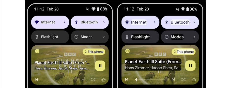
When high contrast mode is turned on in Android 16, the system adds a thin outline around text. This makes light-colored or small text easier to read on dark backgrounds without needing extra code from the developer.
val am = context.getSystemService(AccessibilityManager:: class .java)
// Check if high contrast outline mode is enabled
if (am.isOutlineTextEnabled) {
    // Your custom text creation should draw an outline
      myTextView.setOutlineThickness( 4f )
}
am.addOutlineTextStateChangeListener { enabled ->
    myTextView.setOutlineThickness( if (enabled) 4f   else   0f )
}
With TtsSpan.TYPE_DURATION, you can send duration info like “1 hour 30 minutes” to the Android TTS engine in a more natural format. It reads durations like “one and a half hours” instead of a flat number list, making it clearer in apps like fitness or education.
val  durationSpan  = TtsSpan.Builder(TtsSpan.TYPE_DURATION)
    .putArgument(TtsSpan.DURATION, 5_000L ) // 5 second
     .build()

val  text  = SpannableString( "time: 5 second" )
text.setSpan(durationSpan, 16 , 25 , Spanned.SPAN_EXCLUSIVE_EXCLUSIVE)
myTextView.text = text
You can now use setExpandedState() and CONTENT_CHANGE_TYPE_EXPANDED to tell screen readers whether something is expanded or collapsed like dropdowns or accordions. This gives better context for visually impaired users.
You can link a UI element to more than one label, like a text, icon, and a voice button. This helps screen readers describe it more clearly by using all the labels together.
When you don’t know how long a task will take (like loading data), you can use RANGE_TYPE_INDETERMINATE to tell accessibility services that progress is happening, even if no percentage is available.
You can now add checkboxes with three states: checked, unchecked, and partially checked. This is useful when sub-items are selected in a mixed way, like in folder sync settings.
You can add extra info to a view using setSupplementalDescription() in addition to the regular contentDescription. This helps screen readers give users more context, like “75% done, updated 2 minutes ago”.
You can now mark form fields as required using setFieldRequired(true). Screen readers will inform users that the field is mandatory, reducing form errors.
In Android 16, users with LE Audio hearing aids can now switch between the phone’s microphone and their hearing aid mic. They can also adjust ambient sound volume when using the hearing aid.
val audioManager = getSystemService(AudioManager::class.java)
val devices = audioManager.getDevices(AudioManager.GET_DEVICES_INPUTS)
val hearingAid = devices.firstOrNull { it.type == AudioDeviceInfo.TYPE_HEARING_AID }
hearingAid?.let {
  audioManager.setPreferredDeviceForStrategy(
    AudioAttributes.USAGE_VOICE_COMMUNICATION, it
  )
}
A new Android 16 feature: The Camera2 API now supports a “hybrid AE” mode, giving you control over both ISO (sensor sensitivity) and shutter time at the same time. It offers a great balance between full manual and full auto modes useful for adjusting exposure and dynamic range in professional shoots.
// Enable AE priority on ISO
reqBuilder.set(
  CaptureRequest.CONTROL_AE_MODE,
  CameraMetadata.CONTROL_AE_MODE_ON
)
reqBuilder.set(
  CaptureRequest.CONTROL_AE_PRIORITY_MODE,
  CameraMetadata.CONTROL_AE_PRIORITY_MODE_SENSOR_SENSITIVITY_PRIORITY
)
reqBuilder.set(CaptureRequest.SENSOR_SENSITIVITY, 800)
A new Android 16 feature: With COLOR_CORRECTION_MODE_CCT, you can go beyond built-in AWB modes and control color temperature (Kelvin) and tint at the pixel level. Perfect for film production or scenes where precise color matching is essential.
reqBuilder.set(
  CaptureRequest.CONTROL_AWB_MODE,
  CameraMetadata.CONTROL_AWB_MODE_OFF
)
reqBuilder.set(
  CaptureRequest.COLOR_CORRECTION_MODE,
  CameraMetadata.COLOR_CORRECTION_MODE_CCT
)
reqBuilder.set(
  CaptureRequest.COLOR_CORRECTION_COLOR_TEMPERATURE,
  5500
)
reqBuilder.set(
  CaptureRequest.COLOR_CORRECTION_COLOR_TINT,
  10
)
A new Android 16 feature: Using the EXTENSION_NIGHT_MODE_INDICATOR CaptureResult key, your app can detect whether the current scene calls for night mode. This lets you adjust UI or notify users when night enhancements are active.
val nightMode = result.get(CaptureResult.EXTENSION_NIGHT_MODE_INDICATOR)
if (nightMode == true) {
  overlayView.showNightModeBanner()
}
A new Android 16 feature: The ACTION_MOTION_PHOTO_CAPTURE and ACTION_MOTION_PHOTO_CAPTURE_SECURE intents let you capture both a still photo and a short (3-second) video in one shot. You can play these using MediaMetadataRetriever or show a gif-style preview in your UI.
val intent = Intent(ACTION_MOTION_PHOTO_CAPTURE).apply {
  putExtra(EXTRA_OUTPUT, outputUri)
}
startActivityForResult(intent, MOTION_PHOTO_REQUEST)
A new Android 16 feature: The ImageFormat.HEIC_ULTRAHDR format lets you save Ultra-HDR photos using ISO 21496–1 spec parameters. It combines high dynamic range with efficient file compression.
val captureBuilder = cameraDevice.createCaptureRequest(TEMPLATE_STILL_CAPTURE)
captureBuilder.set(
  CaptureRequest.JPEG_QUALITY, 100
)
captureBuilder.set(
  CaptureRequest.JPEG_THUMBNAIL_SIZE, Size(0, 0)
)
captureBuilder.set(
  CaptureRequest.IMAGE_FORMAT, ImageFormat.HEIC_ULTRAHDR
)
A new Android 16 feature: RangingManager lets you measure distances securely using AES-256 encryption, whether through BLE/RSSI or UWB. You get millimeter-level accuracy great for IoT, smart homes, or asset tracking.
val rm = getSystemService(RangingManager::class.java)
rm.startRanging(params, executor, object : RangingCallback() {
  override fun onRangeResult(results: List<RangingResult>) {
    results.forEach {
      Log.d("Range", "Distance: ${it.distanceMm} mm")
    }
  }
})
PhotoPicker.Builder now has two powerful updates:
// 1. A mixin for layout pickers
val embeddedPresentation = EmbeddedPresentation(
    context = this ,                          // Activity or Fragment context
       Container = findViewById(R.id.photo_picker_container) // Your layout container
 )
// 2. Class with a cloud search provider definition
 MyCloudProvider : SearchProvider {
    override    val id: String = "my_cloud"
    override    fun    createIntent   () : Intent {
        // Return an Intent that starts your cloud browser's user interface
        return Intent( this   @MainActivity , CloudBrowserActivity:: class .java)
    }
}
// 3. Configure PhotoPicker with both embedded and cloud support
val picker = PhotoPicker.Builder()
    .setPresentation(embeddedPresentation)              // Embed the picker in your layout
       .addSearchProvider(MyCloudProvider())               // Add cloud search
       .setMediaTypeFilter(MediaTypeFilter.IMAGES_ONLY) // Only images
       .build()
// 4. Initialize the picker
 startActivityForResult(picker.intent, REQUEST_PICK_IMAGE)
// 5. Run the result in onActivityResult
override  fun onActivityResult (requestCode: Int , resultCode: Int , data : Intent ?) {
    if (requestCode == REQUEST_PICK_IMAGE && resultCode == RESULT_OK) {
        val uri: Uri = PhotoPicker.getPhotoUri( data !!)
        // Show the selected image
          imageView.setImageURI(uri)
    }
}

A new Android 16 feature: The AVC 422–10 profile supports 10-bit color depth, YUV 4:2:2 sampling, and bitrates up to 2 Gbps. This enables pro-level recording, with multi-track video, alpha channels, and high frame rates.
val format = MediaFormat.createVideoFormat("video/avc", width, height)
format.setInteger(MediaFormat.KEY_PROFILE, MediaCodecInfo.CodecProfileLevel.AVCProfileHigh10)
format.setInteger(MediaFormat.KEY_LEVEL, MediaCodecInfo.CodecProfileLevel.AVCLevel51)
format.setInteger(MediaFormat.KEY_BIT_RATE, 2_000_000_000)
– Resources: https://developer.android.com/about/versions/16/features
Author: Uğur Can Işıldar
If you want to check directly the project before continuing reading the introduction, you can do by accessing the following link:

Flutter is an SDK for building fast-moving and engaging cross-platform mobile apps provided by Google. Dart is a development language for Flutter apps. Flutter supports compiling code on both Android, iOS, Web and Desktop using a single code base written in Dart.
MVVM/MVC/MVP/MVI architecture is good enough for most of the applications. But when the application grows, it becomes hard to maintain the huge codebase, and sometimes, it requires refactoring efforts to separate the responsibilities of each and every layer and then clean architecture comes into the picture.
An important goal of clean architecture is to provide developers with a way to organize code in such a way that it encapsulates the business logic but keeps it separate from the delivery mechanism.
I built a Flutter Rorty Application(Rick And Morty) to reinforce what I’ve learned so far and to improve myself.
Rorty focused on the scalability, testability and maintainability written in Dart, following best practices using Flutter.

The project presents a modern, approach to Flutter application development using Dart and latest tech-stack with Flutter.
The goal of the project is to demonstrate best practices, provide a set of guidelines, single module application, scalable, maintainable and testable. This application may look simple, but it has all of these small details that will set the rock-solid foundation of the larger app suitable for bigger teams and long application lifecycle management.
For this project I try to used the Clean Architecture. The MVP Features:


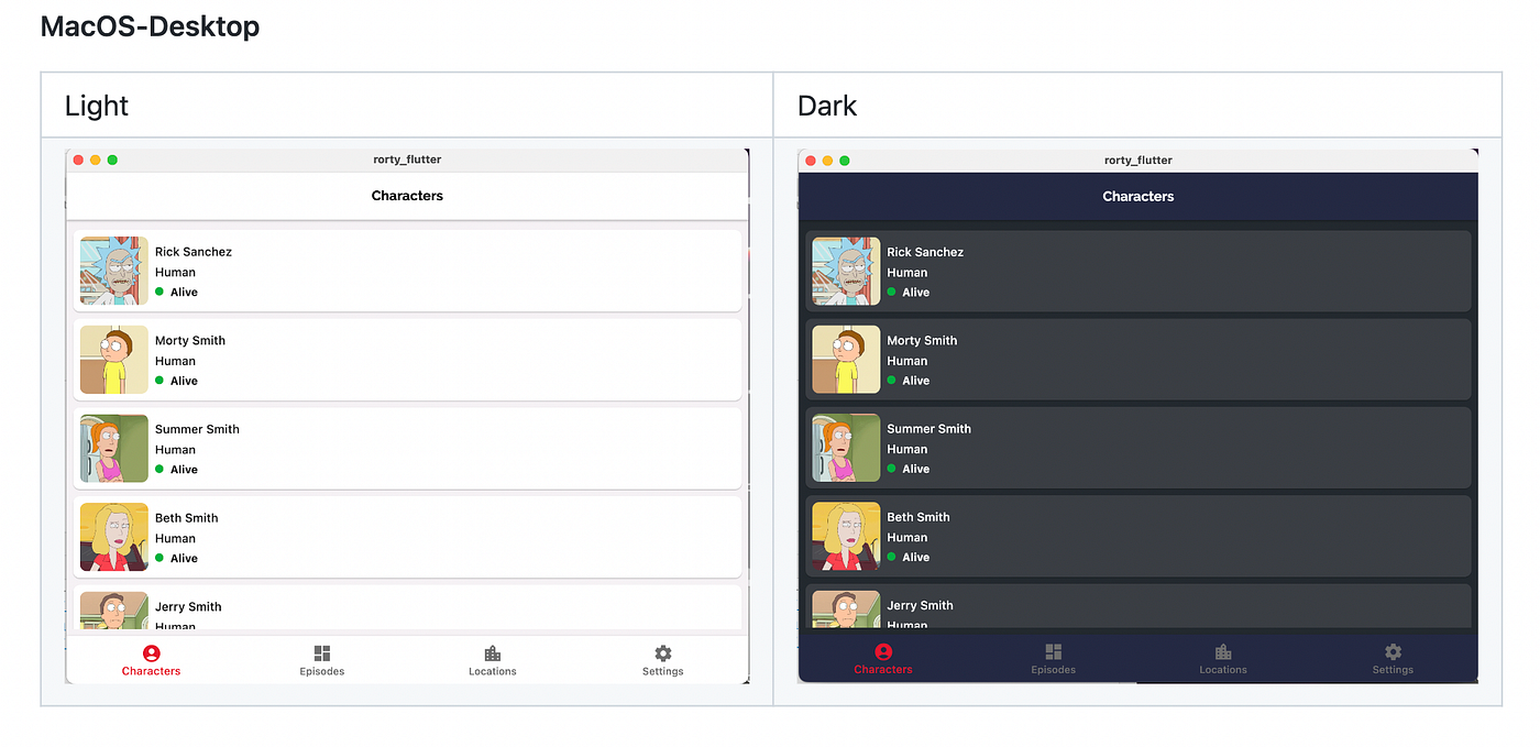

One of the key benefits of clean architecture is supposed to be clear navigation throughout the app and source code. Looking at the root folder of the project, the following structure becomes clear.
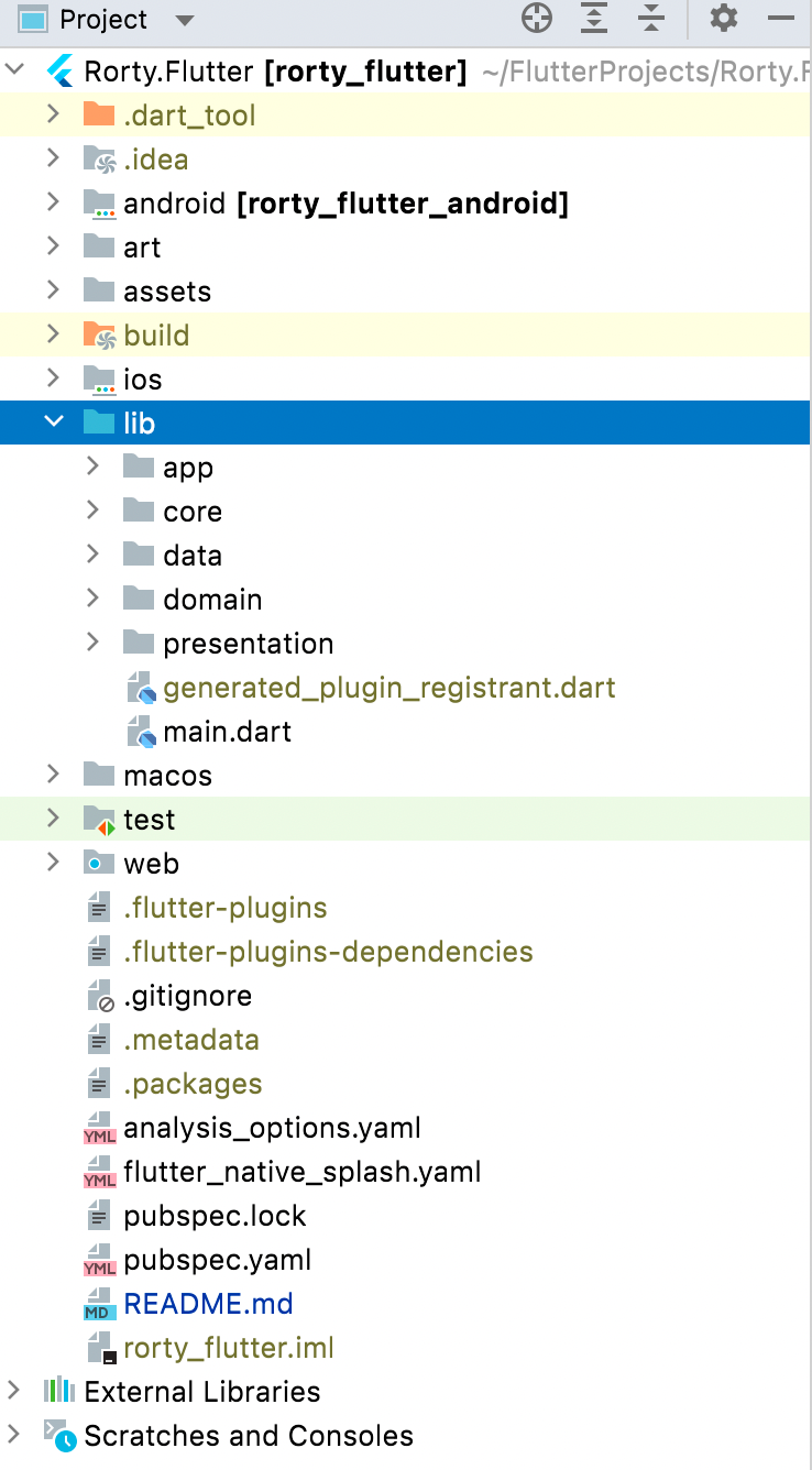
The data layer is responsible for selecting the proper data source for the domain layer. It contains the implementations of the repositories declared in the domain layer.
Components of data layer include:
domain, response and entity models.This is responsible for performing caching operations using Floor.
This is responsible for performing network operations eg. defining API endpoints using Retrofit/Dio.
Responsible for exposing data to the domain layer.
This is the core layer of the application. The domain layer is independent of any other layers thus ] domain business logic can be independent from other layers.This means that changes in other layers will have no effect on domain layer eg. screen UI (presentation layer) or changing database (data layer) will not result in any code change withing domain layer.
Components of domain layer include:
The presentation layer contains components involved in showing information to the user. The main part of this layer are the Views(widgets) and ViewModels.
This project uses many of the popular libraries, plugins and tools of the flutter ecosystem.
Flutter, easy to learn, due to the same codebase for Android and iOS applications, you can use to launch apps on both mobile OS simultaneously also you can develop an app that is accessible to all features natively in Android and iOS.
You can access the source code of the project from the link below.
I hope it helps you. If it is useful to you, you can clap this article and follow me for such these articles.
Happy and healthy coding!
Author: Mesut Genç
In this article, I’ll show you the way to connect firebase to a react app with folder structure.
“The world needs dreamers and the world needs doers. But above all, the world needs dreamers who do.” — Sarah Ban Breathnach
I’m not telling you how to open a project in firebase or create react app. But don’t freak out, I’ll mention important parts.
Let’s get started!
Firstly we’ll set up Firebase,
After logging in to firebase and adding a new project, a project overview page will appear. Now our journey starts. Click the setting icon, then project settings next to the ‘project overview’ text.

Scroll the page until you see your apps section. Select </> (web app). Give a name, and click ‘Register App’. (If you want Firebase Hosting, select the option. This is not our topic today but someday will be.)
Firebase will generate your config variable.
Go back to react project and install firebase SDK to the project.
npm install firebase
Create a new folder named ‘src’. This folder will be our main folder to keep the folder organized and clean. And create another folder named ‘utils’ in src. In this folder, we’ll keep our utility functions such as ‘firebase.js’ which you need to create now.
I’ll talk about react folder structure widely in another article. Follow me and don’t miss upcoming articles.
Copy and paste that firebase-generated config to the firebase.js file. And add the following line import section. We are adding this line because we will get the database in this file and export it.
import { getDatabase } from “firebase/database”;
So our next move is after initializing the app with the config variable, initializing the database, and exporting it;
export const db = getDatabase(app);
So after all this, your firebase file looks like this:
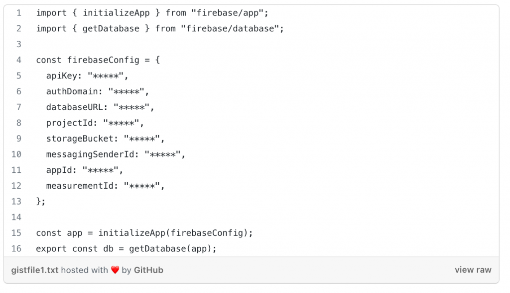
I strongly suggest that use environment variables and keep your keys hidden. Look at this link.
It’s simple as that. Everything is ready now. Now we can use it anywhere in our app!
In the file, you need the fetch data, you can use this utility.
Import this util and some firebase methods then use with reference method from firebase;
import { db } from “../../utils/firebase”;
import { onValue, ref } from “firebase/database”;
Eventually, your code looks like something like this;
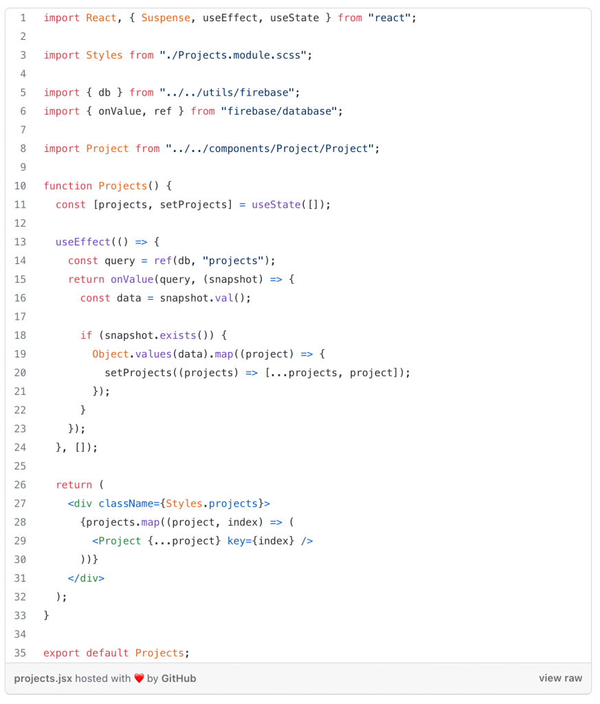
P.S: Do not use the index in keys due to performance considerations. Check out the official documentation.
P.S: The reason we use onValue method in useEffect’s cleanup section is that this method is an unsubscribe method, which means after the job is done connection will be closed, and in this way, we prevent memory leaks on our app.
Hope you enjoyed it!
Author: Mahir Uslu
Herkese merhabalar,
2018 yılında duyurulan, günümüzde de kullanımı artmaya devam eden, alışık olduğumuz virtualenv/pipenv yapısının dışında daha kapsamlı ve komplike bir yapı sunan paketleme yöneticisi ile sizleri tanıştırmak istiyorum, Poetry…
Çok kısa bir özet geçmek gerekirse, Poetry 2018 yılında 0.1 sürümüyle dünyamıza katılmış, pipenv, virtualenv gibi teknolojilerin üstüne geliştirme yaparken yaşanan birkaç uzun aşamayı da kısaltmayı kendine düstur edinmiş bir paket yöneticisi.
Bu kadar övdükten sonra nasıl kullanacağımızı anlatmaya başlayabilirim
Kurulum adımı gayet basit,
Linux/MacOSX için;
curl -sSL https://install.python-poetry.org | python3 -
PowerShell kullanarak yüklemek için (windows);
(Invoke-WebRequest -Uri https://install.python-poetry.org -UseBasicParsing).Content | py -
Kurulum işlemi tamamlandıktan sonra kontrol etmek için;
sezerb@optimist~> poetry --version
Poetry version 1.1.13
Eğer konsol olarak standart bash ya da cmd yerine, zsh, fish gibi konsol kullanmayı tercih ediyorsanız şu komutlardan sizin konsolunuz özelinde olanını seçip tek satırda poetry’i sisteme ekleyebilirsiniz;
# Bash
poetry completions bash > /etc/bash_completion.d/poetry# Fish
poetry completions fish > ~/.config/fish/completions/poetry.fish# Zsh
poetry completions zsh > ~/.zfunc/_poetry# Oh-My-Zsh
mkdir $ZSH_CUSTOM/plugins/poetry
poetry completions zsh > $ZSH_CUSTOM/plugins/poetry/_poetry# prezto
poetry completions zsh > ~/.zprezto/modules/completion/external/src/_poetry
Eğer poetry’i silmek isterseniz;
curl -sSL https://install.python-poetry.org | python3 - --uninstall
curl -sSL https://install.python-poetry.org | POETRY_UNINSTALL=1 python3 -
Projenizi ilk defa oluştururken direkt olarak konsoldan ya da Pycharm yardımıyla Poetry kullanabilirsiniz. Konsoldan;
sezerb@optimist~/working_table> poetry new sample-project
Created package sample_project in sample-project
sezerb@optimist~/working_table> ls
sample-project/
sezerb@optimist~/working_table> cd sample-project/
sezerb@optimist~/w/sample-project> ls
pyproject.toml  README.rst  sample_project/  tests/
sezerb@optimist~/w/sample-project> ls -al
total 20
drwxrwxr-x 4 sezerb sezerb 4096 Jun 13 06:24 ./
drwxrwxr-x 3 sezerb sezerb 4096 Jun 13 06:24 ../
-rw-rw-r-- 1 sezerb sezerb  300 Jun 13 06:24 pyproject.toml
-rw-rw-r-- 1 sezerb sezerb    0 Jun 13 06:24 README.rst
drwxrwxr-x 2 sezerb sezerb 4096 Jun 13 06:24 sample_project/
drwxrwxr-x 2 sezerb sezerb 4096 Jun 13 06:24 tests/
sezerb@optimist~/w/sample-project> cat README.rst
sezerb@optimist~/w/sample-project> cd tests/
sezerb@optimist~/w/s/tests> ls
__init__.py  test_sample_project.py
sezerb@optimist~/w/s/tests> cd ..
sezerb@optimist~/w/sample-project> ls
pyproject.toml  README.rst  sample_project/  tests/
sezerb@ubuntu2204 ~/w/sample-project> cat pyproject.toml
[tool.poetry]
name = "sample-project"
version = "0.1.0"
description = ""
authors = ["Your Name <you@example.com>"][tool.poetry.dependencies]
python = "^3.10"[tool.poetry.dev-dependencies]
pytest = "^5.2"[build-system]
requires = ["poetry-core>=1.0.0"]
build-backend = "poetry.core.masonry.api"
Gördüğünüz gibi tek satır komut ile projenin test kısmı dahil olmak üzere projeyi oluşturup, README dosyası dahil olmak üzere ayağa kaldırıyor. Pycharm ile birlikte kullanmak içinse;

Projenin olduğu dizine gidip;
poetry init
Projenizi oluşturduktan sonra yeni bir bağımlılık ekleme/güncelleme/silme için;
poetry add [package-name] # yeni bağımlılık ekler
poetry remove [package-name] # varolan bir bağımlılığı siler
poetry update [package-name] # eğer paket adı belirtirseniz eklediğiniz paketi, yazmazsanız tüm paketleri son sürüme günceller
Poetry’nin sağladığı bir diğer kolaylıkta farklı python versiyonları ile kodunuzu test edebilmenize imkan tanıması. İsterseniz proje özelinde isterseniz globale farklı versiyonlar yükleyerek kolayca bu python versiyonları arasında gezebilmek mümkün;
pyenv install 3.9.8
pyenv local 3.9.8  # projenizi bu versiyon ile çalıştırmanızı sağlar
poetry install
poetry env use python3.7 # versiyon değişimi
poetry env info # anlık olarak kullandığınız versiyon bilgisi ve detaylarını içerir.
Normalde bir paket hazırladığınızda bu paketi PyPi’ye yüklemekte ayrı bir süreç gerektirirken Poetry bu zahmetten bizleri kurtarıyor, tek yapmanız gereken;
poetry config repositories.foo-pub https://pypi.example.org/legacy/ # projenizin PyPI adresini ekleme
poetry config http-basic.foo-pub <username> <password> # giriş işlemi
poetry publish --build --repository foo-pub # paketinizin build alıp PyPI'ye gönderme
Eğer tüm paketlerimi tek bir paket yöneticisini üzerinden kontrol edeyim, bu paket yöneticisi aynı zamanda ekstra zengin özelliklere sahip olsun, PyPI’ye de paket atmaktan çekinmeyeyim, built-in olarak farklı python versiyonları ile çalışmak istiyorum, projemin dev/test/prod paket bağımlılıklarını konsoldan yöneteyim ve tek bir yaml içerisinde dursun gibi avantajlardan faydalanayım istiyorsanız Poetry tam sizlik. Eğer hiç denemediyseniz varolan bir projenizi de poetry’e taşıyarak başlayabilirsiniz. Üstelik bunun için tek yapmanız gereken “poetry init” komutu vermek, interaktif olarak bu taşıma işini poetry sizinle beraber yapıyor;

Bir başka yazımda görüşmek üzere…
Author: Sezer Bozkır
Presentation about a topic/system/product etc. is not just putting some sentences on a slide with some picture and reading it. It is not checking your notes in every 5 words or not asking bunch of questions which you do not truly understand and just trying to get people into the presentation. It is about convincing people regarding what you are talking about, it is about making them curios for the topic, it is about making them want to learn more about it after the presentation. To be able to make such a presentation, there are several things that a person should pay attention to. Below are the things that a person should do and/or avoid during a presentation.
1. Let’s start!
The start of a presentation is very important to get the attention from the audience. If it is not necessary, do not start with who you are in much detail. If it is necessary, do not use more than 4–5 sentences. Let people know who you are during the presentation with cleverly placed notes and details. Instead of starting with “I have been working 5 years in … technology company as an analyst and it was really nice experience”, during the presentation, when the topic is on the matter of technology or experience, you can say “5 years as an analyst in a tech company was more surprising to me than I expected”. Instead of talking about yourself, you can tell an intriguing short story or topic-related attractive image that will get the attention of the audience.

2. Content
Content of the slides should not be long sentences with unnecessary details. If there are more details in the slides than in what you are saying, the attention of the audience will shift to reading the slides rather than listening to you because you already have the all the details in the slides. Use words or phrases that will give only a hint about what you are going to talk about next in slides, and audience will be more into listening to you. The images to support your slide should be carefully selected and not divert attention as well but also not far from the topic just to attract attention. There should be a logical connection between what you have on the screen and what you are talking about.

3. Format of the slides
The format of the slides is another important topic. Do not use many different and dazzling colors but use some different fonts and colors maybe to emphasize the most important ones in the slide. If everything is in different color or font size, it will cause only confusion.

4. Eye contact
It is nice to have prepared notes, but it is bad to read from them like a machine. You need to have eye contact with your audience and see their reaction to what you say. This is important to have concrete presentation so that you can build on your topic while making the presentation. If you do not know your audience’s reaction to a certain point you are making, you will not be able to build on that point further in the way you wanted. Keep eye contact with your audience and not only with one or two of them but rather all of them so they will understand that this is a presentation for all of them and they all should pay attention.

5. Weird sounds
Do not use “eehhm”, “ııımmm”, “aaaa” sound to remember what you will say next, or do not use such sounds to pause during the presentation. It is uncomfortable to hear these things and people will start to think that you are not familiar with the topic. It may start to irritate the audience after a while. You can pause for two seconds instead of making those noises.

6. Appearance
Make sure that the audience see both you and your slides on the stage. If only your slides are in the lights, it will be like a story with picture on the screen after a while, and people will lose attention and might even get sleepy. Too much dark is not your friend. You too should be in the light to get attention.
7. Tone
Use your voice effectively and emphasize main points you want to make in a different tone or level. The same level of voice throughout the presentation will start to bore people after a while. If you lose your audience once in the presentation it is hard to get their attention back. Do not lose them!

8. Ending
While concluding, somehow make people aware that this is going to be last part of the presentation and get their full attention so that they will remember after you are done. You do not have to take questions necessarily, but it is nice to give some time to the audience to ask questions or want you to clarify a point or give some feedbacks. If it is a time limited presentation, you should be done with presentation while %10–15 of your time remains for Q&A. In other words, use your time efficiently, and do not rush to finish the presentation. Make your plan beforehand, if the time is not enough, there are some things in the presentation which you should not have. Remove them! The ending should be perfect, what you told so far, what you have shown so far is to build on a topic so that your audience will remember the most important things about your presentation. Do not repeat what your already said in detail. Use short, effective, and phrased sentences to make remind your most important points. And if it is possible, leave them in curiosity to learn more about the topic in the end.

Author: Tayyip Adal
Let’s explain using gradle kotlin dsl with buildSrc.
In this blog, we will learn how to migrate our Android application project from a Groovy-based Gradle system to a Kotlin-based Gradle system with the help of Kotlin DSL.
Different ways of managing Gradle dependencies:
We will apply Kotlin DSL + buildSrc step in our projects.
buildSrc is a directory at the project root level which contains build info. We can use this directory to enable kotlin-dsl and write logic related to custom configuration and share them across the project. It was one of the most used approaches in recent days because of its testability.
The directory
buildSrcis treated as an included build. Upon discovery of the directory, Gradle automatically compiles and tests this code and puts it in the classpath of your build script. For multi-project builds, there can be only onebuildSrcdirectory, which has to sit in the root project directory.buildSrcshould be preferred over script plugins as it is easier to maintain, refactor and test the code — Gradle Docs
as the docs say, in multi-module projects, there is only one buildSrc module and all modules can access it since it is placed in the classpath of build script, seems like a good place to put our Gradle logics to be reused.

FAILURE: Build failed with an exception.
* What went wrong:
‘buildSrc’ cannot be used as a project name as it is a reserved name


build.gradle to build.gradle.kts in buildSrc folder.

’kotlin-dsl’ in build.gradle.ktsbuildSrc/build.gradle.kts
plugins {
    `kotlin-dsl`
}repositories {
    google()
    mavenCentral()
    gradlePluginPortal()
}
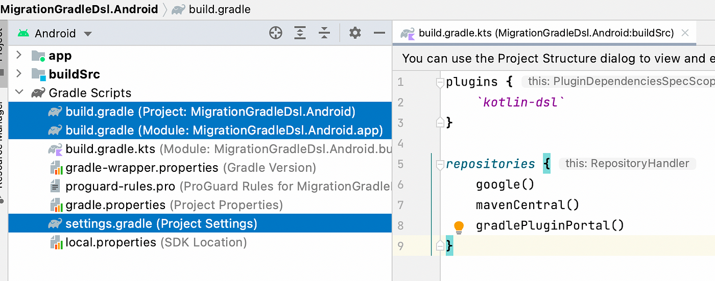
settings.gradle to settings.gradle.kts. After that, if you try to compile, errors as below will show.
include ’:app’ to include(":app")
That’s it. You’re done for settings.gradle.kts. You can compile the project and it works with other Gradle files.
build.gradle to build.gradle.kts, using the steps provided above. Now you need to fix the syntax accordingly.Before

After

Finally, the last file to convert to Kotlin, which has the most syntax change.
But before that, let’s convert the build.gradle to build.gradle.kts first, using the steps provided above.
Now, we can continue to convert the syntax as following.
plugins {
    id 'com.android.application'
    id 'org.jetbrains.kotlin.android'
}
to the below
plugins {
    id("com.android.application")
    id("org.jetbrains.kotlin.android")
}
android {
    compileSdk 32

    defaultConfig {
        applicationId "com.developersancho.migrationgradledsl"
        minSdk 23
        targetSdk 32
        versionCode 1
        versionName "1.0"

        testInstrumentationRunner "androidx.test.runner.AndroidJUnitRunner"
        vectorDrawables {
            useSupportLibrary true
        }
    }

    buildTypes {
        release {
            minifyEnabled false
            proguardFiles getDefaultProguardFile('proguard-android-optimize.txt'), 'proguard-rules.pro'
        }
    }
    compileOptions {
        sourceCompatibility JavaVersion.VERSION_1_8
        targetCompatibility JavaVersion.VERSION_1_8
    }
    kotlinOptions {
        jvmTarget = '1.8'
    }
    buildFeatures {
        compose true
    }
    composeOptions {
        kotlinCompilerExtensionVersion compose_version
    }
    packagingOptions {
        resources {
            excludes += '/META-INF/{AL2.0,LGPL2.1}'
        }
    }
}
to the below
android {
    compileSdk = 32

    defaultConfig {
        applicationId = "com.developersancho.migrationgradledsl"
        minSdk = 23
        targetSdk = 32
        versionCode = 1
        versionName = "1.0"

        testInstrumentationRunner = "androidx.test.runner.AndroidJUnitRunner"
        vectorDrawables {
            useSupportLibrary = true
        }
    }

    buildTypes {
        release {
            isMinifyEnabled = false
            proguardFiles(
                    getDefaultProguardFile("proguard-android-optimize.txt"),
                    "proguard-rules.pro"
            )
        }
    }
    compileOptions {
        sourceCompatibility = JavaVersion.VERSION_11
        targetCompatibility = JavaVersion.VERSION_11
    }
    kotlinOptions {
        jvmTarget = JavaVersion.VERSION_11.toString()
    }
    buildFeatures {
        compose = true
    }
    composeOptions {
        kotlinCompilerExtensionVersion = rootProject.extra["compose_version"] as String
    }
    packagingOptions {
        resources {
            excludes += "/META-INF/{AL2.0,LGPL2.1}"
        }
    }
}
dependencies {
    implementation 'androidx.core:core-ktx:1.7.0'
    implementation "androidx.compose.ui:ui:$compose_version"
    implementation "androidx.compose.material:material:$compose_version"
    implementation "androidx.compose.ui:ui-tooling-preview:$compose_version"
    implementation 'androidx.lifecycle:lifecycle-runtime-ktx:2.4.1'
    implementation 'androidx.activity:activity-compose:1.4.0'
    testImplementation 'junit:junit:4.13.2'
    androidTestImplementation 'androidx.test.ext:junit:1.1.3'
    androidTestImplementation 'androidx.test.espresso:espresso-core:3.4.0'
    androidTestImplementation "androidx.compose.ui:ui-test-junit4:$compose_version"
    debugImplementation "androidx.compose.ui:ui-tooling:$compose_version"
}
to the below
dependencies {
    implementation("androidx.core:core-ktx:1.7.0")
    implementation("androidx.compose.ui:ui:${rootProject.extra["compose_version"]}")
    implementation("androidx.compose.material:material:${rootProject.extra["compose_version"]}")
    implementation("androidx.compose.ui:ui-tooling-preview:${rootProject.extra["compose_version"]}")
    implementation("androidx.lifecycle:lifecycle-runtime-ktx:2.4.1")
    implementation("androidx.activity:activity-compose:1.4.0")
    testImplementation("junit:junit:4.13.2")
    androidTestImplementation("androidx.test.ext:junit:1.1.3")
    androidTestImplementation("androidx.test.espresso:espresso-core:3.4.0")
    androidTestImplementation("androidx.compose.ui:ui-test-junit4:${rootProject.extra["compose_version"]}")
    debugImplementation("androidx.compose.ui:ui-tooling:${rootProject.extra["compose_version"]}")
    debugImplementation("androidx.compose.ui:ui-test-manifest:${rootProject.extra["compose_version"]}")
}
Now we done. All the Gradle file is now converted to Kotlin.
I highly recommend the “Kotlin DSL + buildSrc” option. It may not seem like it’s that big of a deal, but managing Gradle dependencies is a pain, and having autocomplete and click support is a game changer. No more switching back and forth between files manually.
Happy and healthy coding!
Author: Mesut Genç
Apple has included 3D touch in its devices with the release of the iPhone 6s and iPhone 6s Plus. (2015)
This function has been replaced with the Haptic Touch, which lets you to perform various activities immediately through fast actions.To do typical tasks, you don’t need to launch an app. If you want to shoot a selfie, for example, you don’t need to open the Camera app. With a simple tap on the Camera app, you can take a selfie directly or in the Maps app, you may either mark your destination or submit your location easily from your Home Screen.
In this post, we’ll create a simple banking Android app that opens your accounts , see latest transfers , currency transactions and let’s say nearby branches of your bank as well as add static “App Shortcuts” to it. Keep in mind that App shortcuts are dynamic in nature, as you may add, remove, and edit them.
Setting up the App Shortcuts
Adding some information to the launcher activity in your AndroidManifest.xml is the first and most important step in implementing your shortcuts.
We added the <meta-data> tag to the launcher activity “SplashActivity” in our example, with the name attribute android.app.shortcuts and the resource (xml/splash_shortcuts) :

As shown in the AndroidManifest file, our app contains the SplashActivity, and we will navigate to the NearByBranchesActivity , AccountsActivity, CurrencyTransactionsActivity and LatestTransfersActivity via the shortcuts.
From the above manifest, it is obvious that we should create the folder
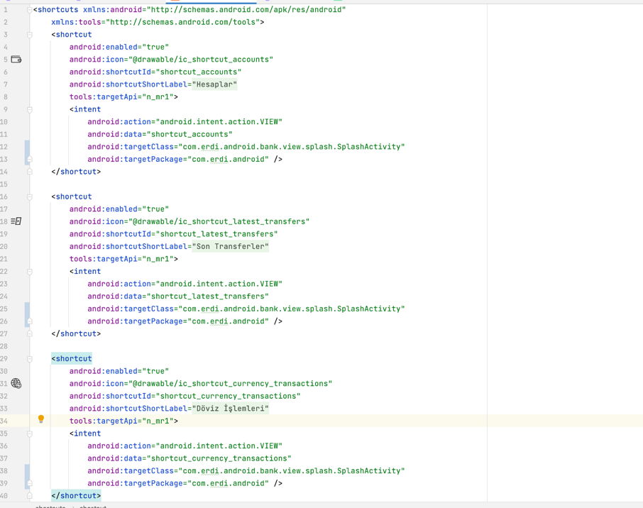
Each <shortcut> element provides information about a static shortcut, such as its icon, labels for its description, and the intents it launches within the app; it must have at least one <intent> element.
The descriptions for the various characteristics inside a static shortcut are listed below. For android:shortcutId and android:shortcutShortLabel, you must give a value. The rest of the parameters are optional.
You can also follow the characteristics of shortcut attributes from https://developer.android.com/guide/topics/ui/shortcuts.
Last but not the least, you should handle this intent data from other activites. I can suggest that you should create ShortcutUtil or Shortcut enum to store the shortcuts like given below from my codes (here ı prefer ShortcutUtil class to store shortcut of the wanted screen) :

After that , you should handle the these shortcut utils like ;

But here our data represent our intent.dataString.
Now ı can show you our application will be like ;

Author: Erdi Koç
Build better apps faster with Jetpack Compose
In this post, i will try to explain what is jetpack compose and how to setup environment, creating project for jetpack compose.
Jetpack Compose is Android’s modern toolkit for building native UI. It simplifies and accelerates UI development on Android. Quickly bring your app to life with less code, powerful tools, and intuitive Kotlin APIs. It makes building Android UI faster and easier.
Android isn’t the only supported platform. For start, you can use it in Web and Desktop — Multiplatform apps.


build.gradle file.


Jetpack Compose offers an implementation of Material Design, a comprehensive design system for creating digital interfaces. A Material Theme contains color, typography and shape attributes. When you customize these attributes, your changes are automatically reflected in the components you use to build your app.
@Composable
fun JetComposeDemoTheme(
    darkTheme: Boolean = isSystemInDarkTheme(),
    content: @Composable () -> Unit
) {
    val colors = if (darkTheme) {
        DarkColorPalette
    } else {
        LightColorPalette
    }

    MaterialTheme(
        colors = colors,
        typography = Typography,
        shapes = Shapes,
        content = content
    )
}
Color: Colors are modelled in Compose with the Color class, a simple data-holding class. Styling with colors from the wrapped theme is easy and you can use values from the theme anywhere a color is needed.
package com.developersancho.jetcomposedemo.ui.theme

import androidx.compose.ui.graphics.Color

val Purple200 = Color(0xFFBB86FC)
val Purple500 = Color(0xFF6200EE)
val Purple700 = Color(0xFF3700B3)
val Teal200 = Color(0xFF03DAC5)
private val DarkColorPalette = darkColors(
    primary = Purple200,
    primaryVariant = Purple700,
    secondary = Teal200
)

private val LightColorPalette = lightColors(
    primary = Purple500,
    primaryVariant = Purple700,
    secondary = Teal200
Typography: Material defines a type system, encouraging you to use a small number of semantically-named styles.
package com.developersancho.jetcomposedemo.ui.theme

import androidx.compose.material.Typography
import androidx.compose.ui.text.TextStyle
import androidx.compose.ui.text.font.FontFamily
import androidx.compose.ui.text.font.FontWeight
import androidx.compose.ui.unit.sp

// Set of Material typography styles to start with
val Typography = Typography(
    body1 = TextStyle(
        fontFamily = FontFamily.Default,
        fontWeight = FontWeight.Normal,
        fontSize = 16.sp
    )
    /* Other default text styles to override
    button = TextStyle(
        fontFamily = FontFamily.Default,
        fontWeight = FontWeight.W500,
        fontSize = 14.sp
    ),
    caption = TextStyle(
        fontFamily = FontFamily.Default,
        fontWeight = FontWeight.Normal,
        fontSize = 12.sp
    )
    */
)
Shape: Material defines a shape system, allowing you to define shapes for large, medium, and small components.
package com.developersancho.jetcomposedemo.ui.theme

import androidx.compose.foundation.shape.RoundedCornerShape
import androidx.compose.material.Shapes
import androidx.compose.ui.unit.dp

val Shapes = Shapes(
    small = RoundedCornerShape(4.dp),
    medium = RoundedCornerShape(4.dp),
    large = RoundedCornerShape(0.dp)
)
In order to start developing with Jetpack compose, we need a Class that is inherited from the Activity or Fragment classes.
setContent{}: This block defines the activity’s layout where we call composable functions.(in xml like “setContentView(R.layout.activity_main)” )
Surface(): Material surface is the central metaphor in material design. Each surface exists at a given elevation, which influences how that piece of surface visually relates to other surfaces and how that surface casts shadows.
Modifiers: Could be compared to xml attributes that you traditionally use to style your UI. Applied matters and by leveraging padding and coloring in various orders we can achieve many different UI combinations.
class MainActivity : ComponentActivity() {
    override fun onCreate(savedInstanceState: Bundle?) {
        super.onCreate(savedInstanceState)
        setContent {
            JetComposeDemoTheme {
                // A surface container using the 'background' color from the theme
                Surface(
                    modifier = Modifier.fillMaxSize(),
                    color = MaterialTheme.colors.background
                ) {
                    Greeting("Innovance")
                }
            }
        }
    }
}
Text(): This puts a text view on screen. Also the function that is defined by the Compose UI library displays a text label on the screen.(in xml like “TextView” )
@Composable: This annotation specifies the following method is using Jetpack compose for creating views.
@Composable
fun Greeting(name: String) {
    Text(text = "Hello $name :)")
}
@Preview: This annotation will be shown onto the studio’s design section. Preview is just for the development, when we run in actual device it’s not gonna be useful.
@Preview(showBackground = true)
@Composable
fun DefaultPreview() {
    JetComposeDemoTheme {
        Greeting("Innovance")
    }
}

Happy coding!
Author: Mesut Genç
In this post, I will try to explain how we can use once ViewBinding at Activity, Fragment, Dialog, View and RecyclerViewHolder.
View binding is a feature that allows you to more easily write code that interacts with views. Once view binding is enabled in a module, it generates a binding class for each XML layout file present in that module. An instance of a binding class contains direct references to all views that have an ID in the corresponding layout.
In most cases, view binding replaces findViewById.
A binding class is usually generated for each layout file when using view binding. The binding class stores all the references to particular views.
View binding is null-safe and fast. It allows developers to avoid common errors during programming.
View binding is enabled on a module by module basis. To enable view binding in a module, set the viewBinding build option to true in the module-level build.gradle file, as shown in the following example:
android {
    ...
    buildFeatures {
        viewBinding = true
    }
}
If you want a layout file to be ignored while generating binding classes, add the tools:viewBindingIgnore="true" attribute to the root view of that layout file:
<ConstraintLayout
        ...
        tools:viewBindingIgnore="true" >
    ...
</ConstraintLayout>
Once enabled for a project, view binding will generate a binding class for all of your layouts automatically. The name of the binding class is generated by converting the name of the XML file to Pascal case and adding the word “Binding” to the end.
Once this is done, you can use the binding class whenever you inflate layouts such as Fragment, Activity,Dialog , View and RecyclerViewHolder.
We have extension methods for using ViewBinding. I will try to explain step by step. The full codes are below.
ViewBindingExtensions.kt
import android.view.LayoutInflater
import android.view.ViewGroup
import androidx.viewbinding.ViewBinding
import java.lang.reflect.ParameterizedTypeinternal fun <V : ViewBinding> Class<*>.getBinding(layoutInflater: LayoutInflater): V {
    return try {
        @Suppress("UNCHECKED_CAST")
        getMethod(
            "inflate",
            LayoutInflater::class.java
        ).invoke(null, layoutInflater) as V
    } catch (ex: Exception) {
        throw RuntimeException("The ViewBinding inflate function has been changed.", ex)
    }
}internal fun <V : ViewBinding> Class<*>.getBinding(
    layoutInflater: LayoutInflater,
    container: ViewGroup?
): V {
    return try {
        @Suppress("UNCHECKED_CAST")
        getMethod(
            "inflate",
            LayoutInflater::class.java,
            ViewGroup::class.java,
            Boolean::class.java
        ).invoke(null, layoutInflater, container, false) as V
    } catch (ex: Exception) {
        throw RuntimeException("The ViewBinding inflate function has been changed.", ex)
    }
}internal fun Class<*>.checkMethod(): Boolean {
    return try {
        getMethod(
            "inflate",
            LayoutInflater::class.java
        )
        true
    } catch (ex: Exception) {
        false
    }
}internal fun Any.findClass(): Class<*> {
    var javaClass: Class<*> = this.javaClass
    var result: Class<*>? = null
    while (result == null || !result.checkMethod()) {
        result = (javaClass.genericSuperclass as? ParameterizedType)
            ?.actualTypeArguments?.firstOrNull {
                if (it is Class<*>) {
                    it.checkMethod()
                } else {
                    false
                }
            } as? Class<*>
        javaClass = javaClass.superclass
    }
    return result
}inline fun <reified V : ViewBinding> ViewGroup.toBinding(): V {
    return V::class.java.getMethod(
        "inflate",
        LayoutInflater::class.java,
        ViewGroup::class.java,
        Boolean::class.java
    ).invoke(null, LayoutInflater.from(context), this, false) as V
}********************************************************************
internal fun <V : ViewBinding> BindingActivity<V>.getBinding(): V {
    return findClass().getBinding(layoutInflater)
}internal fun <V : ViewBinding> BindingFragment<V>.getBinding(
    inflater: LayoutInflater,
    container: ViewGroup?
): V {
    return findClass().getBinding(inflater, container)
}internal fun <V : ViewBinding> BindingSheetDialog<V>.getBinding(
    inflater: LayoutInflater,
    container: ViewGroup?
): V {
    return findClass().getBinding(inflater, container)
}internal fun <V : ViewBinding> BindingComponent<V>.getBinding(
    inflater: LayoutInflater,
    container: ViewGroup?
): V {
    return findClass().getBinding(inflater, container)
}
To set up an instance of the binding class for use with a RecyclerView Adapter, you need to pass the generated binding class object to the holder class constructor.
We have row_character XML file for RecyclerView row item and the generated class is RowCharacterBinding .
row_character.xml
<?xml version="1.0" encoding="utf-8"?>
<com.google.android.material.card.MaterialCardView xmlns:android="http://schemas.android.com/apk/res/android"
    xmlns:app="http://schemas.android.com/apk/res-auto"
    xmlns:tools="http://schemas.android.com/tools"
    android:id="@+id/card"
    android:layout_width="match_parent"
    android:layout_height="wrap_content"
    app:cardElevation="4dp"
    app:cardUseCompatPadding="false">    <androidx.constraintlayout.widget.ConstraintLayout
        android:layout_width="match_parent"
        android:layout_height="wrap_content">        <com.google.android.material.textview.MaterialTextView
            android:id="@+id/tvName"
            android:layout_width="0dp"
            android:layout_height="wrap_content"
            android:layout_marginStart="8dp"
            android:layout_marginTop="16dp"
            android:layout_marginEnd="8dp"
            app:layout_constraintEnd_toEndOf="parent"
            app:layout_constraintTop_toTopOf="parent"
            tools:text="Mr.Sanchez" />    </androidx.constraintlayout.widget.ConstraintLayout></com.google.android.material.card.MaterialCardView>
BindingViewHolder class from extends ViewHolder class.BindingViewHolder.kt
import android.content.Context
import androidx.recyclerview.widget.RecyclerView
import androidx.viewbinding.ViewBinding/**
 * A Simple [BindingViewHolder] providing easier support for ViewBinding
 */
open class BindingViewHolder<VB : ViewBinding>(val binding: VB) :
    RecyclerView.ViewHolder(binding.root) {
    val context: Context = binding.root.context
}
CharactersViewHolderclass is as follows.CharactersViewHolder.kt
inner class CharactersViewHolder(binding: RowCharacterBinding) :
    BindingViewHolder<RowCharacterBinding>(binding) {    fun bind(item: Character) {
        ....
        binding.tvName.text = item.name
        ....
        binding.root.setOnClickListener {
            ....
        }
    }
}
inline fun <reified V : ViewBinding> ViewGroup.toBinding(): V {
    return V::class.java.getMethod(
        "inflate",
        LayoutInflater::class.java,
        ViewGroup::class.java,
        Boolean::class.java
    ).invoke(null, LayoutInflater.from(context), this, false) as V
}
onCreateViewHolder to pass “parent.toBinding()” the generated binding class to the ViewHolder class.override fun onCreateViewHolder(parent: ViewGroup, viewType: Int): RecyclerView.ViewHolder {
return CharactersViewHolder(parent.toBinding())
}
To set up an instance of the binding class for use with an Activity, perform the following steps in the BindingActivity:
BindingActivity() class from extends AppCompatActivity() class.import android.os.Bundle
import androidx.appcompat.app.AppCompatActivity
import androidx.viewbinding.ViewBindingopen class BindingActivity<VB : ViewBinding> : AppCompatActivity() {
.......
}
internal fun <V : ViewBinding> BindingActivity<V>.getBinding(): V {
    return findClass().getBinding(layoutInflater)
}
setContentView() at BindingActivity.kt file.BindingActivity.kt
import android.os.Bundle
import androidx.appcompat.app.AppCompatActivity
import androidx.viewbinding.ViewBindingopen class BindingActivity<VB : ViewBinding> : AppCompatActivity() {    lateinit var binding: VB    override fun onCreate(savedInstanceState: Bundle?) {
        super.onCreate(savedInstanceState)
        if (::binding.isInitialized.not()) {
            binding = getBinding()
            setContentView(binding.root)
        }
    }
}
BindingActivity() .MainActivity.kt
class MainActivity : BindingActivity<ActivityMainBinding>() {    override fun onCreate(savedInstanceState: Bundle?) {
        super.onCreate(savedInstanceState)        ......
        binding.tvName.text = "NAME"
    }
}
To set up an instance of the binding class for use with a Fragment, perform the following steps in the BindingFragment:
BindingFragment() class from extends Fragment() class.open class BindingFragment<VB : ViewBinding> : Fragment() { .....}
internal fun <V : ViewBinding> BindingFragment<V>.getBinding(
    inflater: LayoutInflater,
    container: ViewGroup?
): V {
    return findClass().getBinding(inflater, container)
}
onCreateView() at BindingFragment.kt file.BindingFragment.kt
import android.os.Bundle
import android.view.LayoutInflater
import android.view.View
import android.view.ViewGroup
import androidx.fragment.app.Fragment
import androidx.viewbinding.ViewBindingopen class BindingFragment<VB : ViewBinding> : Fragment() {    private var _binding: VB? = null    val binding: VB
        get() = _binding
            ?: throw RuntimeException("Should only use binding after onCreateView and before onDestroyView")    protected fun requireBinding(): VB = requireNotNull(_binding)    final override fun onCreateView(
        inflater: LayoutInflater,
        container: ViewGroup?,
        savedInstanceState: Bundle?
    ): View {
        _binding = getBinding(inflater, container)
        return binding.root
    }    override fun onDestroyView() {
        super.onDestroyView()
        _binding = null
    }
}
BindingFragment() .CharactersFragment.kt
class CharactersFragment : BindingFragment<FragmentCharactersBinding>() {    override fun onViewCreated(view: View, savedInstanceState: Bundle?) {
        super.onViewCreated(view, savedInstanceState)        ......
        binding.tvName.text = "NAME"
    }
}
To set up an instance of the binding class for use with an BottomSheetDialogFragment , perform the following steps in the BindingSheetDialog:
BindingSheetDialog() class from the extends BottomSheetDialogFragment() class.open class BindingSheetDialog<VB : ViewBinding> : BottomSheetDialogFragment() { .......
}
internal fun <V : ViewBinding> BindingSheetDialog<V>.getBinding(
    inflater: LayoutInflater,
    container: ViewGroup?
): V {
    return findClass().getBinding(inflater, container)
}
onCreateView() at BindingSheetDialog.kt file.import android.os.Bundle
import android.view.LayoutInflater
import android.view.View
import android.view.ViewGroup
import androidx.viewbinding.ViewBinding
import com.google.android.material.bottomsheet.BottomSheetDialogFragmentopen class BindingSheetDialog<VB : ViewBinding> : BottomSheetDialogFragment() { private var _binding: VB? = null protected val binding: VB
get() = _binding
?: throw RuntimeException("Should only use binding after onCreateView and before onDestroyView") override fun onCreateView(
inflater: LayoutInflater,
container: ViewGroup?,
savedInstanceState: Bundle?
): View {
_binding = getBinding(inflater, container)
return binding.root
} override fun onDestroyView() {
super.onDestroyView()
_binding = null
}
}
To set up an instance of the binding class for use with an Layout, perform the following steps in the layout:
BindingComponent() class from extends ConstraintLayout() class.open class BindingComponent<VB : ViewBinding> @JvmOverloads constructor(
context: Context,
attrs: AttributeSet? = null
) : ConstraintLayout(context, attrs) { .....
}
internal fun <V : ViewBinding> BindingComponent<V>.getBinding(
    inflater: LayoutInflater,
    container: ViewGroup?
): V {
    return findClass().getBinding(inflater, container)
}
val Context.inflater get() = LayoutInflater.from(this)********************************************************************open class BindingComponent<VB : ViewBinding> @JvmOverloads constructor(
    context: Context,
    attrs: AttributeSet? = null
) : ConstraintLayout(context, attrs) {    lateinit var binding: VB    init {
        initBinding()
    }    private fun initBinding() {
        if (::binding.isInitialized.not()) {
            binding = getBinding(context.inflater, container = this)
        }
    }
}
View binding has important advantages over using findViewById:
@Nullable.These differences mean that incompatibilities between your layout and your code will result in your build failing at compile time rather than at runtime.
View binding and data binding both generate binding classes that you can use to reference views directly. However, view binding is intended to handle simpler use cases and provides the following benefits over data binding:
Conversely, view binding has the following limitations compared to data binding:
Because of these considerations, it is best in some cases to use both view binding and data binding in a project. You can use data binding in layouts that require advanced features and use view binding in layouts that do not.
To make your code reusable don’t try putting everything in a giant binding activity, fragment, view or recyclerViewHolder(inheritance), instead introduce composition with the help of extension functions or dividing logic into different classes. Because:
Happy coding!
Author: Mesut Genç
Only In 2017, Google officially accepted Kotlin as the second official language for Android app development. At the end of the second quarter of 2019 Google has declared that Kotlin has been preferred as a programming language for Android app developers. Popularity of the Kotlin has increased overwhelmingly in the past two years. According to Google, more than 50% of professional Android developers currently use the language to develop apps, and it is the fourth most popular programming language according to the latest Stack Overflow developer survey. But what is Kotlin, why does Google suggest Kotlin as the preferred language? Let’s dig it!
For kotlinlang.org, “Kotlin is a modern but already mature programming language aimed to make developers happier. It’s concise, safe, interoperable with Java and other languages, and provides many ways to reuse code between multiple platforms for productive programming.”. Basically, it is an object-oriented programming language (like Java 🙂 ) that also allows functional programming. It is designed by JetBrains teams who created the IntelliJ IDEA , and now you will probably guess that Kotlin is fully compatible with Java of course 🙂 You can use any java libraries in your Kotlin project with clarity, tooling support, safety and interoperability. Unlike Java, you can code iOS applications using Kotlin.
Hmm ok, but what is the differences between Java and Kotlin, and why is Kotlin better than Java?
According to the official Kotlin web site you can clearly see what Kotlin has that Java does not (https://kotlinlang.org/docs/comparison-to-java.html#what-kotlin-has-that-java-does-not). As an Android developer, syntax going to be the first thing that comes to my mind. We can save lots of lines of code while working with Kotlin. Let me explain basically. If you are writing Data Transfer Objects in Java, your code probably looks like similar to hashCode, equals, toString, getters, setters and constructors. For simple objects like for example Course with id, name, capacity, email, schoolName you will have approximately 70+ lines of codes as shown below.
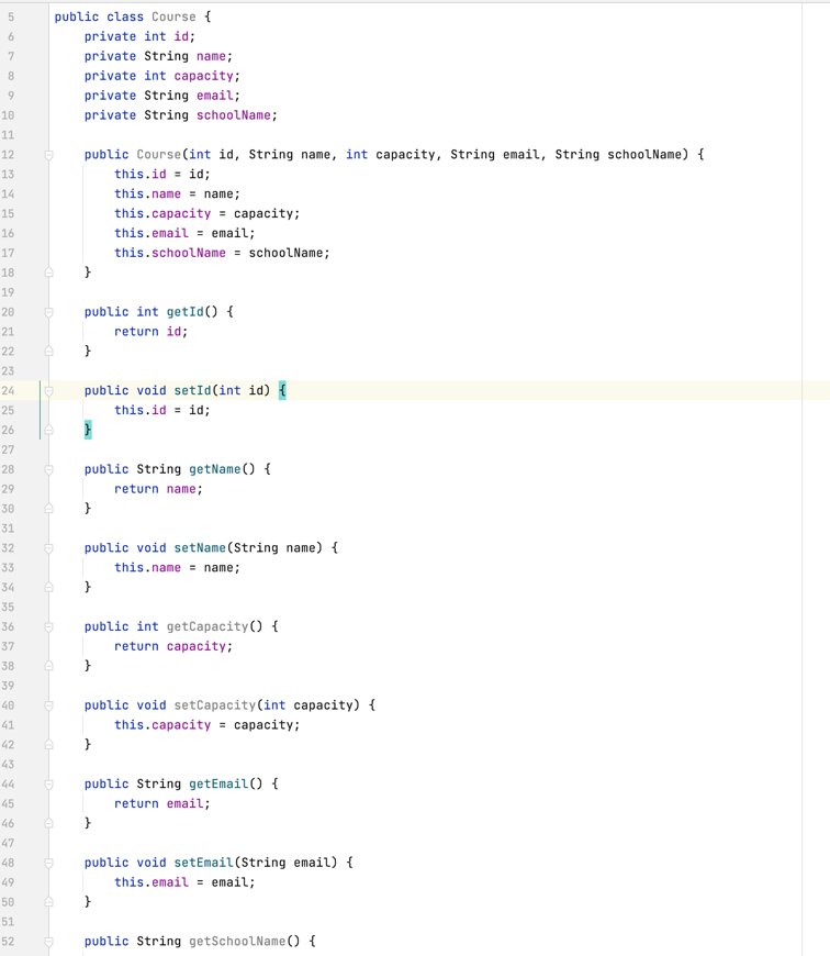
How will this “Course” object look in Kotlin?

It takes only a single line of code to write Course DTO object in Kotlin with more transparent and easier to understand.
I believe that according to many developers concision should never take precedence over readability. Boilerplate code is difficult to read, results with more bugs and takes more time attempting to find them.
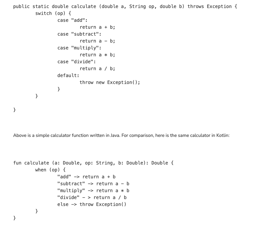
In Android projects you can have both Kotlin and Java languages simultaneously. This means that you can migrate your Java project to Kotlin easily with only small steps.
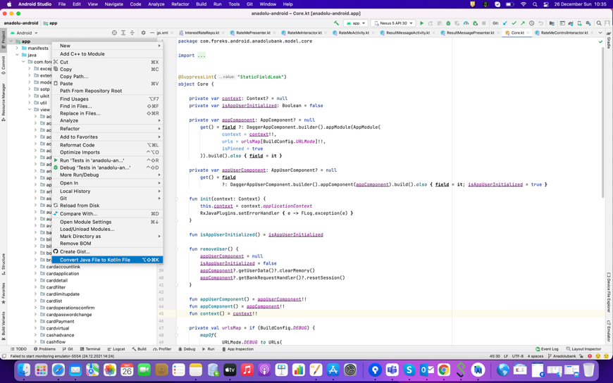
In most circumstances, you don’t need to use explicit cast operators in Kotlin since the compiler keeps note of is-checks and explicit casts for immutable values and automatically inserts (safe) casts as needed; What I am trying to say is that Kotlin compiler is tracking code logic and automatically cast type object for example:
Example 1:

Example 2:

With Kotlin,you can use improved version of Java Lambdas. Kotlin functions can be saved in variables and data structures, as well as passed to and returned by higher-order functions. (https://en.wikipedia.org/wiki/First-class_function)
Let me give you a simple example of a high-order function mapMutable. It takes transform values and applies the given transform function to each element of the original array and appends the results to the given destination, returns as mutable list.

Assume that you want to show a menu list in your application. Firstly you need to create menu list item data class as given below (you can change variables when needed)

Second, you need to determine which item types will be in your list.

Last but not the least, if we want to show that menu we need to create generic list adapter using recycler view in our xml file. However; I won’t show you how to do it right now because this will be our another section of reading.
Now, I will show you how can you use your mapMutable object in that list , we have interface function to show the list of our main menu items.

Additionally, we have setDefault function to set the list in our onViewCreated function when class rendering we want to set list as default.

As an Java or Android developers we all encountered with Null Pointer Exception and this exception can easily destroy the applications. (https://en.wikipedia.org/wiki/Tony_Hoare#Apologies_and_retractions ) Kotlin solves this issue by incorporating inherent null safety. This feature eliminates the need for developers to write additional code to deal with the problem. (https://kotlinlang.org/docs/null-safety.html#safe-calls)
Raw types can cause a CastClassException, and the fault will occur during execution rather than compilation.Kotlin does not support raw types, it produces more type-safe code.
Checked exceptions are often unnecessary and cause empty each blocks (as always actually 🙂 ). Developers don’t like non-existent checked exceptions because empty catch blocks force them to search through code to find a non-existent exception. As a result, Kotlin eliminates them entirely, reducing verbosity and improving type safety.
Of course NOT!
Java is a well-known programming language that comes with a plethora of open source tools and libraries to aid programmers. As a matter of fact, the language is not perfect , and even Java has issues that can make developer’s job more difficult. Kotlin helps solving common programming problems while improving the Java ecosystem as a whole. Kotlin has evolved into a more stable and consistent development alternative for Android Studio during the last four years. As all developers guessed in 2017, Kotlin supplant Java as the preferred language for Android Development. Even today many companies make their projects with Kotlin and Java at the same time, they think that they can be coexist without one overpowering the other.
Author: Erdi Koç