Before using GitHub Copilot I have started AI pair development with ChatGPT. Even though I have three monitors, switching monitors was not fun because I am the kind of person who wants to fully focus the screen when the IDE is opened. Then I started to look for Android Studio plugins that can improve my productivity to embed ChatGPT or other AI products.
Then I encountered Github Copilot and found it was worth a try. They offer a 30-day trial. Also if you are suitable for one of the following criteria you can use it free.
GitHub Copilot is free to use for verified students, teachers, and maintainers of popular open source projects. If you are not a student, teacher, or maintainer of a popular open source project, you can try GitHub Copilot for free with a one-time 30-day trial.
Anyways here are what I learnt to use Github Copilot better
How to Install Github Copilot
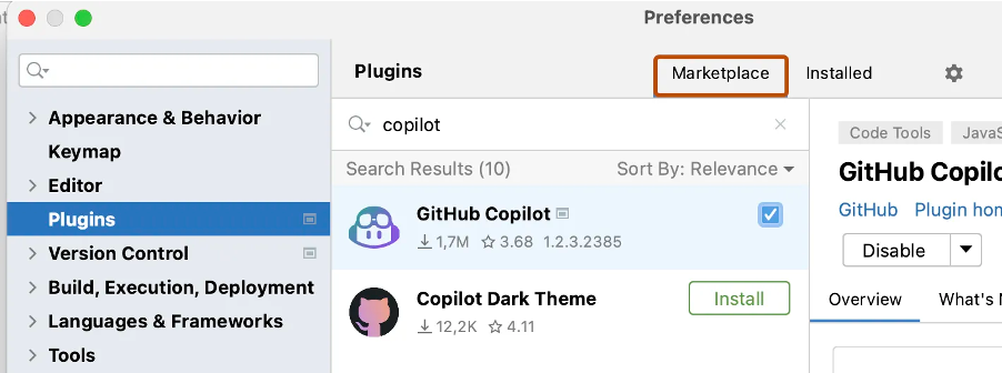
To use GitHub Copilot in AndroidStudio you must install Copilot extension.
Click the settings from menu then find the Plugins section. Click Marketplace. In the search bar, search for GitHub Copilot, then click Install.
After GitHub Copilot is installed restart AndroidStudio.
After your AndroidStudio has restarted, click the Tools menu. Click GitHub Copilot, then click Login to GitHub.
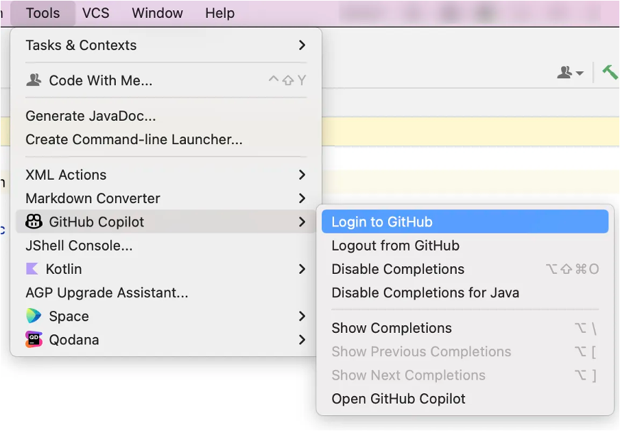
In the “Sign in to GitHub” dialog box, and copy device activation code and open browser with this action. Then paste activation code to activation window in browser. GitHub will request the necessary permissions for GitHub Copilot. To approve these permissions, click Authorize GitHub Copilot Plugin.

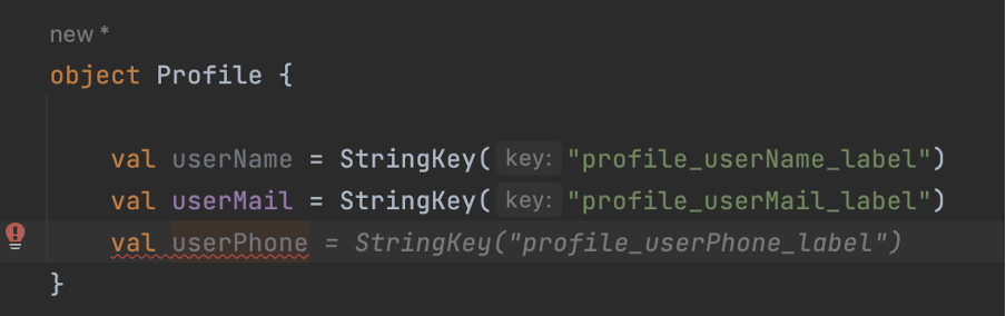
Using patterns in your codes helps AI to predict more accurately and this also makes your code cleaner. As the following example, instance name and string have patterns to make code more predictable. Otherwise, AI would suggest random meaningful string resources which may not expected.
Let’s say we want to check app update status and AI recommend a function that is just nothing but returns false.
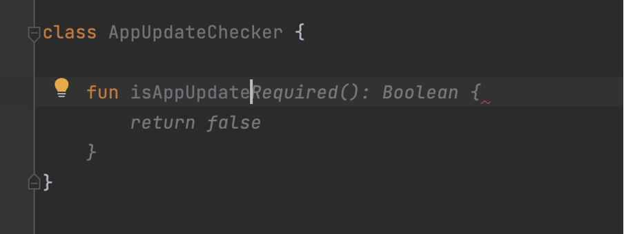
In these kinds of functions, we should refer to use cases as comments. Also, it will help other developers understand how the function works.
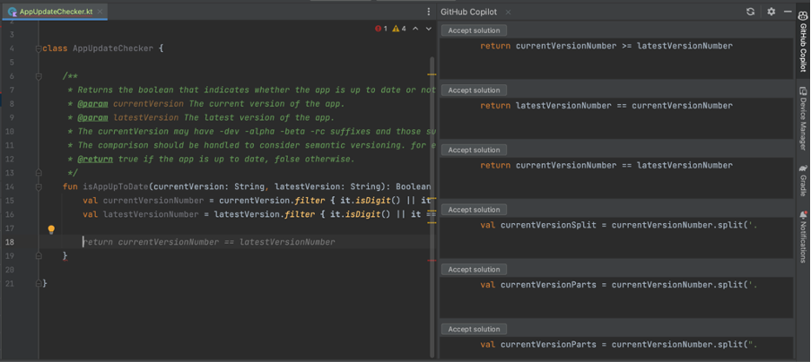
Copilot will encourage the simplest solution as much as possible but the simplest does not mean a working solution so we can help it to select which way it should continue. After guiding it will complete a function as expected but you should all time review the code is written by AI because it may finish similar to right solution, but it might not be
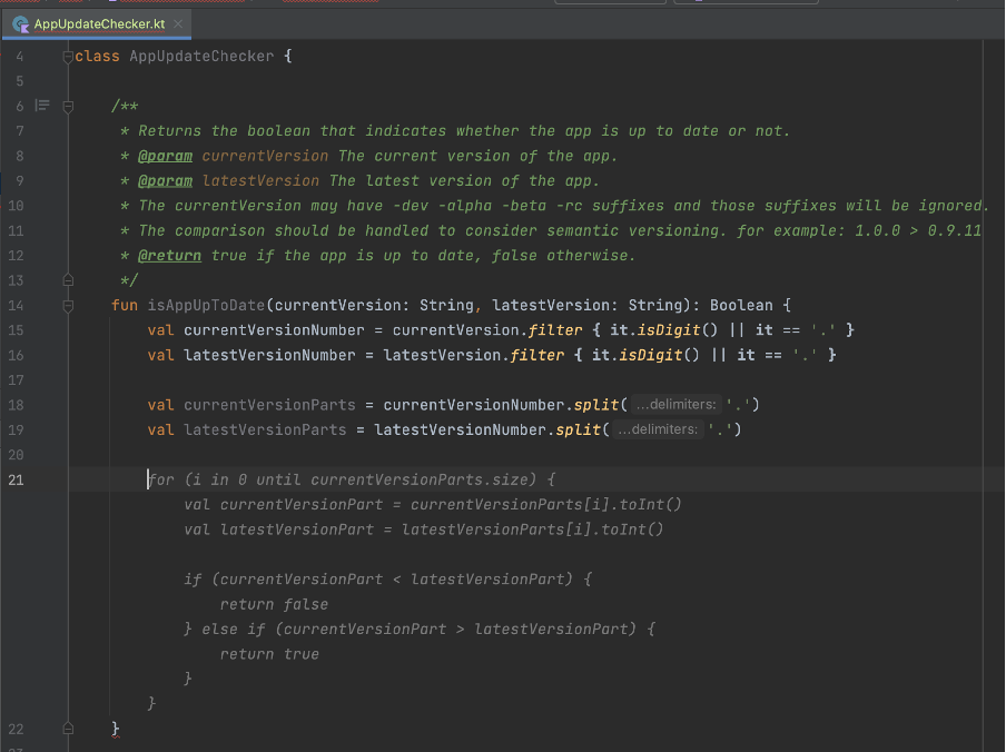
We can take this part as prompt engineering.
Copilot helps us to find the most popular code completion from the git repos, but it does not mean the right or best solution. For example, the following example copilot suggested that I create html-supported text with android.text.Html.FROM_HTML_MODE_LEGACY flag.
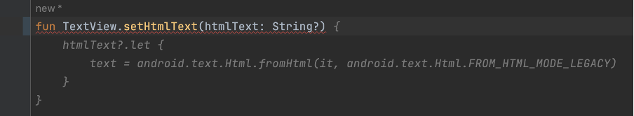
I do not go into details about my project but the android project that supports Android API 24 or higher so using android.text.Html.FROM_HTML_MODE_COMPACT is going to make more sense. That shows Copilot may not suggest you project target build or something similar dependencies. Reviewing process is still vital.
I started a project with CoPilot and it is open. It seems creating your code and resources suggestible and sustainable patterns help CoPilot’s understanding and suggesting algorithm. Also, it helps a developer too. I like this kind of encouragement.
Sometimes it makes vital suggestions but if you review the code that is not a big deal you can easily get the next suggestion, you can give a good prompt over comment or you can make a starting point of function to help it.
I handed my workload about %30 percent. When I see the plugin is not opened and not making suggestions due to the IDE plugin bug issue, I do not continue before reopening IDE that shows it helps me.
Author: Gökberk Yağcı
Thanks to our experience in banking services infrastructure and solid resources, Innovance successfully carried out the project with the client’s teams. Innovance formed a team by combining its experience in banking infrastructure with its strong technology team as members of the bank’s own team. With this powerful team, Innovance provided training for the software development teams of the bank, resulting in a major impact that exceeded expectations in a very short period of time.
Innovance has migrated the related systems including Tibco technology with closed-source code used as the middle layer (MW) and service infrastructure within the bank, to an open-source Java architecture tailored to the bank’s standards. Initially, Innovance transformed all related channels of the bank (Branch, Internet Banking, Mobile Banking, Call Center, IVR, etc.) to the new banking service infrastructure using this middle layer, enabling the development of new services on the updated architecture. As a result, the combined teams responsible for various modules such as retail credits, corporate credits, open banking, and internal corporate applications were initiated to use this new structure. In this new dynamic system, the bank currently continues to transform the services in their own modules in an ongoing Project.
One of the main goals during this transformation was to ensure that the existing screens were not affected by the infrastructure changes by not altering the inputs nor outputs of all related services. We successfully accomplished this objective within approximately one year.
In the second phase of the project, Innovance identified high-volume services in the old infrastructure consuming 80% of the CPU (with an average call duration of 150 seconds) and enabled the closed-source system to eliminate a significant portion of licenses and server costs. Innovance migrated approximately 5,000 (around 55% of the remaining services) to the new architecture by making performance improvements. To facilitate this migration and make it compatible with the new system, and standardizing it, Innovance developed a “code generator” over a period of 1.5 years, and subsequently completed the migration process. The second phase of this major transformation took approximately 3 years to complete.
Why was this transformation required?
If your bank is also in need of a similar success story, please contact us via www.innovance.com.tr/contact and let us be your solution partner.
In the last decade, the popularity of remote work has been increasing rapidly among employers and employees. After the pandemic in 2020, especially in the information technology sector, remote work become more and more popular. Most employers started to offer the option to work from home entirely or hybrid. People can work almost anywhere these days, at home, in coffee shops, or in any location with a stable internet connection. These advancements and capabilities caused a big change in traditional work arrangements. While remote work has many benefits and opportunities for both employees and employers these days, it also comes with some disadvantages.
Flexibility is one of the most significant advantages of remote work. Any location with a stable internet connection can be used as an office for employees. Also, people can choose to work in the period in which they are most productive, early in the morning, late at night, slightly noisy, totally quiet etc. With this opportunity, employees feel more comfortable and can be more productive. It also creates the chance to adjust their work with other activities such as housework, children care, outside office business etc. Instead of taking time from work while in the office, an employee can adjust his/her daily work according to these activities and not fall behind the work schedule.
Many studies and surveys, remote workers’ productivity is higher than office-based workers. Many factors play roles in this outcome. Workers have more autonomy in their work, more focused on tasks away from distractions in the office such as chats, meetings, office issues etc. Without these distractions, remote workers can concentrate on their work, which results in higher productivity.
Cost saving is another significant advantage for both employees and employers. Transportation costs and time for employees are high to go to an office. The main cost for employees is time on this issue. This time on the way can be used more productively. From the employers’ point of view, this is cost-saving in literal terms. Office costs, utilities, and other expenses regarding maintaining an office can be avoided. In addition to this, since a person can work from anywhere, the pool of potential employees is getting bigger for companies. A person even from another company can easily be employed.
However, the fact that there are many advantages of remote work does not change the reality of some disadvantages it brings to the table. For example, technology lies at the core of remote work for almost every industry. It may be harder to communicate and get the necessary information for a colleague than face to face. Miscommunication, delays, and problems within teams can be caused by this. Also, people can get isolated from colleagues, companies, and even society for that matter. This may result in a lack of motivation, decrease job satisfaction, and getting away from company culture and principles.
Of course, these problems may be averted with gatherings, social occasions, and different activities from time to time. This can help workers to stay connected, maintain relationships and have more motivation toward their job and company.
To conclude, advantages and disadvantages are possible to occur for remote work as on many topics, it depends on both employees and employers to create these outcomes. Remote work became a very important indicator for employees to accept a job, but bad execution of remote work can end up in worse ways than expected. The success of remote work depends on effective communication, a good work environment, and a clear understanding of the expectations and responsibilities of one another. Maintaining a good balance will result in a good outcome for both sides.
Author: Tayyip Adal
User experience and ergonomics are now almost the most important metrics in today’s web and mobile applications. In this direction, stepper is one of the leading screen design trends, especially in progressive transactions such as payment, registration process or identity verification. Stepper is an indispensable design component, which provides information about which step the user is on and how the road map will be in front of them, and when it is presented with a design that is pleasing to the eye, it greatly enhances the user experience.


In this article, I am going to explain how we can create the design of a multifunctional stepper component in the iOS ecosystem with the Swift language and how we can easily implement it in the design of application screens. Let’s get started, pleasant reading 🙂
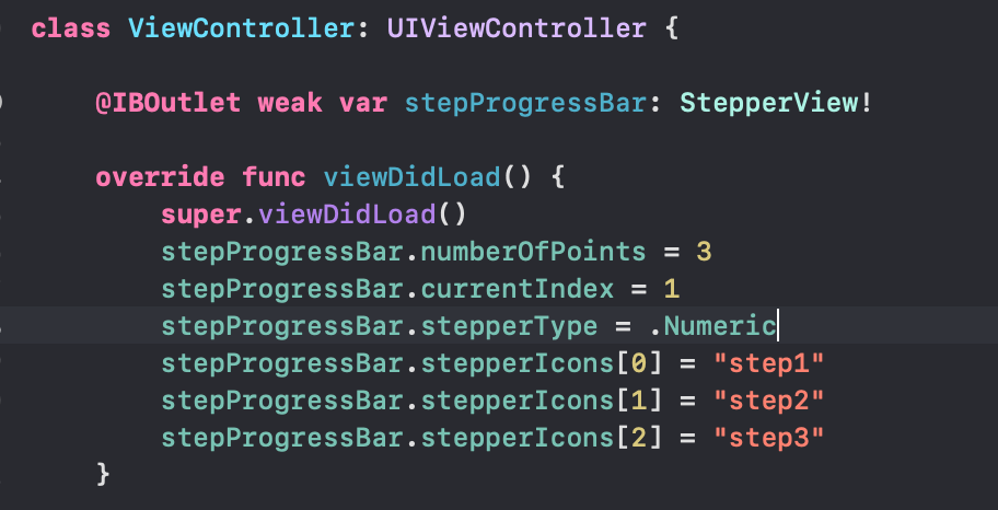
While starting the working logic of the component, let’s first look at the variables and objects we use in the component. Since there are different usage scenarios, there is an enum structure where we choose the stepper type. This enum consists of two cases, .Numeric and .Icon. We can create a numeric stepper or a stepper consisting of icons. We will be setting this when we implement it on the screens. If the stepper will be implemented with the .Icon selection, it is fed by a dictionary called stepperIcons. This dictionary contains the names of the icons used in the steps of the stepper. These names can be the names of the icons in the Assets folder or the names of the system icons.
import UIKit

@IBDesignable
final class StepperView: UIView {

    enum StepperType {
        case Numeric
        case Icon
    }
    /// The stepper type selection
    var stepperType: StepperType = .Numeric
    var stepperIcons = [Int:String]()
numberOfPoints, currentIndex and completedTillIndex are the variables that hold information about how many steps the stepper will have, the current step and the completed steps up to the current step. We will use these variables when drawing the steps.
The lineHeight and radius variables are the most important variables that allow us to draw. The lineHeight variable holds the thickness of the line between two steps and the radius variable holds the radius of each circular step. Both of these variables have computed properties called _lineHeight and _radius, and the actual calculation of the variables takes place in these computed properties.
/// The number of displayed points in the component
    @IBInspectable var numberOfPoints: Int = 3 {
        didSet {
            setNeedsDisplay()
        }
    }

    /// The current selected index
    @IBInspectable var currentIndex: Int = 1 {
        didSet {
            setNeedsDisplay()
        }
    }

    @objc var completedTillIndex: Int = -1 {
        didSet {
            setNeedsDisplay()
        }
    }

    @objc private var currentSelectedCenterColor = UIColor(red: 101.0/255.0, green: 66.0/255.0, blue: 190.0/255.0, alpha: 1.0)
    @objc private var centerLayerTextColor = UIColor(red: 156.0/255.0, green: 145.0/255.0, blue: 158.0/255.0, alpha: 1.0)


    private var lineHeight: CGFloat = 1.0 {
        didSet {
            setNeedsDisplay()
        }
    }

    @objc private var textDistance: CGFloat = 20.0 {
        didSet {
            setNeedsDisplay()
        }
    }

    private var _lineHeight: CGFloat {
        get {
            if lineHeight == .zero || lineHeight > bounds.height {
                return bounds.height * 0.4
            }
            return lineHeight
        }
    }

    /// The point's radius
    private var radius: CGFloat = 40.0 {
        didSet {
            setNeedsDisplay()
        }
    }

    private var _radius: CGFloat {
        get {
            if radius == .zero || radius > bounds.height / 2.0 {
                return bounds.height / 2.0
            }
            return radius
        }
    }
While drawing the stepper, I used CALayer and CATextLayer structures using Core Animation. In fact, the designs seen by the user on the screen consist of layers. With the different objects we place on these layers, we reveal the entire design.
We keep the layers required for the component we will design in a private variable. Then, when our component is init with a commonInit function, we add these layers to the main layer as sublayers. I created a few different layers here as an example. I don’t use all of these layers in the component.
// MARK: - Private properties

    private var backgroundLayer = CALayer()

    private var progressLayer = CAShapeLayer()

    private var selectionLayer = CAShapeLayer()

    private var clearSelectionLayer = CAShapeLayer()

    private var clearLastStateLayer = CAShapeLayer()

    private var lastStateLayer = CAShapeLayer()

    private var lastStateCenterLayer = CAShapeLayer()

    private var selectionCenterLayer = CAShapeLayer()

    private var roadToSelectionLayer = CAShapeLayer()

    private var clearCentersLayer = CAShapeLayer()

    private var maskLayer = CAShapeLayer()

    private var centerPoints = [CGPoint]()

    private var _textLayers = [Int: CATextLayer]()

    private var _customImageLayers = [Int: CALayer]()

    private var _imageLayers = [Int: CALayer]()

    private var previousIndex: Int = 0

    // MARK: - Life cycle
    override init(frame: CGRect = .zero) {
        super.init(frame: frame)
        commonInit()
    }

    required init?(coder aDecoder: NSCoder) {
        super.init(coder: aDecoder)
        commonInit()
    }

    func commonInit() {
        layer.addSublayer(clearCentersLayer)
        layer.addSublayer(backgroundLayer)
        layer.addSublayer(progressLayer)
        layer.addSublayer(clearSelectionLayer)
        layer.addSublayer(selectionCenterLayer)
        layer.addSublayer(selectionLayer)
        layer.addSublayer(roadToSelectionLayer)
        progressLayer.mask = maskLayer

        contentMode = UIView.ContentMode.redraw
    }
override func draw(_ rect: CGRect) {
        super.draw(rect)

        completedTillIndex = currentIndex

        centerPoints.removeAll()

        let distanceBetweenCircles = (bounds.width - (CGFloat(numberOfPoints) * 2 * _radius)) / CGFloat(numberOfPoints - 1)

        var xCursor: CGFloat = _radius


        for _ in 0...(numberOfPoints - 1) {
            centerPoints.append(CGPoint(x: xCursor, y: bounds.height / 2))
            xCursor += 2 * _radius + distanceBetweenCircles
        }

        let bgPath = _shapePath(centerPoints, aRadius: _radius, aLineHeight: _lineHeight)
        backgroundLayer = bgPath

        switch stepperType {
        case .Numeric:
            renderTextIndexes()
        case .Icon:
            renderCustomImageIndexes()
        }
        renderImageIndexes()
    }
We can actually think of this as the setup function where we collect everything and put it together to draw it on the screen. We fill the StepperView with the draw function we override from UIView.
We determine the current state of the stepper by mapping completedTillIndex to currentIndex.
The centerPoints[] array is a CGPoints array that holds the exact position of the steps.
To calculate the distance between each point, we subtract the total diameter of the steps from the total width of the stepper and divide by the number of steps. In this way, we can calculate the equal distance between each stepper.
Then, in a for loop, we calculate the exact position where each step will be drawn using the radius and the variable that holds the distance between the steps and append it to the centerPoints array. You can think of xCursor as the cursor pointing to the point here. At the end of each loop, we update the position of xCursor to iterate.
Then we assign the layer that we drew in the _shapeLayer function to the backgroundLayer we created. We add the backgroundLayer as a sublayer in commonInit.
The drawing of the layers and the calculation of the points is complete. All that remains is to determine the content of each step. By doing this in the renderTextIndexes(), renderImageIndexes() and renderCustomImageIndexes() functions that we call according to the stepperType, the lifecycle of the component is completed.
Apart from layer drawings, another main topic is the creation of step indexes in the layer. In this example, I created the component over three layers. If the stepper will be used as .numeric, the renderTextIndexes() and renderImageIndexes() functions are enough for stepper drawing. If the stepper is in .icon format, we use the renderImageIndexes() and renderCustomIndexes() functions.
private func renderTextIndexes() {
        if (stepperType == .Numeric) {
            for index in 0...(numberOfPoints - 1) {
                let centerPoint = centerPoints[index]

                let textLayer = _textLayer(atIndex: index)

                textLayer.contentsScale = UIScreen.main.scale
                textLayer.font = centerLayerTextFont
                textLayer.fontSize = (centerLayerTextFont?.pointSize)!

                if index == currentIndex || index == completedTillIndex {
                    textLayer.foregroundColor = UIColor.white.cgColor
                } else {
                    textLayer.foregroundColor = centerLayerTextColor.cgColor
                }

                if index < currentIndex {
                    textLayer.string = ""
                } else {
                    textLayer.string = "\(index + 1)"
                }

                textLayer.frame = .init(origin: CGPoint(x: 0.0, y: 0.0), size: textLayer.preferredFrameSize())
                textLayer.frame = CGRect(x: centerPoint.x - textLayer.bounds.width / 2,
                                         y: centerPoint.y - (textLayer.fontSize) / 2 - (textLayer.bounds.height - textLayer.fontSize) / 2,
                                         width: textLayer.bounds.width,
                                         height: textLayer.bounds.height)

            }
        }
    }
    private func renderImageIndexes() {
        for index in 0...(numberOfPoints - 1) {
            let centerPoint = centerPoints[index]

            let imageLayer = _imageLayer(atIndex: index)

            imageLayer.contentsScale = UIScreen.main.scale

            if (index < currentIndex) {
                imageLayer.isHidden = false
            } else {
                imageLayer.isHidden = true
            }

            imageLayer.frame.size = CGSize(width: 21, height: 21)

            imageLayer.frame = CGRect(x: centerPoint.x - imageLayer.bounds.width / 2,
                                      y: centerPoint.y - imageLayer.bounds.height / 2,
                                      width: imageLayer.bounds.width,
                                      height: imageLayer.bounds.height)
        }
    }
private func renderCustomImageIndexes() {
        for index in 0...(numberOfPoints - 1) {
            let centerPoint = centerPoints[index]

            let customImageLayer = _customImageLayer(atIndex: index)

            customImageLayer.contentsScale = UIScreen.main.scale

            if !(index < currentIndex) {
                customImageLayer.isHidden = false
            } else {
                customImageLayer.isHidden = true
            }

            if (index == numberOfPoints - 1) {
                customImageLayer.frame.size = CGSize(width: 18, height: 20.24)
            } else {
                customImageLayer.frame.size = CGSize(width: 21, height: 21)
            }

            customImageLayer.frame = CGRect(x: centerPoint.x - customImageLayer.bounds.width / 2,
                                            y: centerPoint.y - customImageLayer.bounds.height / 2,
                                            width: customImageLayer.bounds.width,
                                            height: customImageLayer.bounds.height)
        }
    }
Each of these functions determines the content of a layer. The center points for drawing are taken from the centerPoints array. There are _textLayer, _imageLayer and _customImageLayer functions used in each function, which create the layers. The layers created using these functions are shown or hidden according to the currentIndex.
The _textLayer() function creates the layer with the numbers in the .numeric stepper. The _imageLayer() function creates the layer with the done icon in the completed steps. Finally, the _customImageLayer() function creates the layer with the icons in each step if the stepper is in the .Icon view. If the index in the for loop is greater than or equal to the currentIndex, the imageLayer is hidden and vice versa.
At the end of the each render functions, the frame of the layer is rendered according to the coordinates in the centerPoints.
private func _textLayer(atIndex index: Int) -> CATextLayer {

        var textLayer: CATextLayer
        if let _textLayer = _textLayers[index] {
            textLayer = _textLayer
        } else {
            textLayer = CATextLayer()
            _textLayers[index] = textLayer
        }
        layer.addSublayer(textLayer)
        return textLayer
    }
    private func _imageLayer(atIndex index: Int) -> CALayer {

        var imageLayer: CALayer
        if let _imageLayer = _imageLayers[index] {
            imageLayer = _imageLayer
        } else {
            imageLayer = CALayer()
            //            imageLayer.contents = UIImage(systemName: "star.fill")?.cgImage
            imageLayer.contents = UIImage(named: "doneStep")?.cgImage
            _imageLayers[index] = imageLayer
        }
        layer.addSublayer(imageLayer)

        return imageLayer
    }
private func _customImageLayer(atIndex index: Int) -> CALayer {
        var customImagelayer: CALayer
        let uncheckedIconColor = UIColor(red: 156.0/255.0, green: 145.0/255.0, blue: 158.0/255.0, alpha: 1.0)
        let checkedIconColor = UIColor.orange
            if let _customImageLayer = _customImageLayers[index] {
                customImagelayer = _customImageLayer
            } else {
                customImagelayer = CALayer()
                var stepIcon = UIImage(named: stepperIcons[index] ?? "")
                if index <= currentIndex {
                    customImagelayer.contents = stepIcon?.withColor(checkedIconColor)
                } else {
                    customImagelayer.contents = stepIcon?.withColor(uncheckedIconColor)
                }
                _customImageLayers[index] = customImagelayer
            }
        layer.addSublayer(customImagelayer)

        return customImagelayer
    }
We mentioned that the _draw() function is where we put all the pieces together. The most important of these parts is the _shapePath() function. In this function, we are drawing all the calculations we made using UIBezierPath().
private func _shapePath(_ centerPoints: [CGPoint], aRadius: CGFloat, aLineHeight: CGFloat) -> CALayer {

        let nbPoint = centerPoints.count

        for i in 0..<nbPoint{
            let centerPoint = centerPoints[i]
            let shape: UIBezierPath
            let fillLayer = CAShapeLayer()
            shape = UIBezierPath(roundedRect: CGRect(x: centerPoint.x - aRadius, y: centerPoint.y - aRadius, width: 2.0 * aRadius, height: 2.0 * aRadius), cornerRadius: aRadius)

            /// Background color set of step points.
            switch stepperType {
            case .Icon:
                if i <= currentIndex {
                    fillLayer.path = shape.cgPath
                    fillLayer.fillColor = UIColor(red: 214.0/255.0, green: 204.0/255.0, blue: 178.0/255.0, alpha: 0.8).cgColor

                }else{
                    fillLayer.path = shape.cgPath
                    fillLayer.fillColor = UIColor(red: 231.0/255.0, green: 229.0/255.0, blue: 232.0/255.0, alpha: 1.0).cgColor
                }
            case .Numeric:
                if i <= currentIndex{
                    if i != currentIndex {
                        fillLayer.path = shape.cgPath
                        fillLayer.fillColor = backgroundShapeColor.cgColor
                    } else {
                        fillLayer.path = shape.cgPath
                        fillLayer.fillColor = UIColor.orange.cgColor
                    }
                }else{
                    fillLayer.path = shape.cgPath
                    fillLayer.fillColor = backgroundShapeColor.cgColor
                }
            }
            layer.addSublayer(fillLayer)

            let shapeLayer = CAShapeLayer()
            if nbPoint > 1 && i != nbPoint - 1{
                //design the path
                let path = UIBezierPath()
                let nextPoint = centerPoints[i + 1]
                path.move(to: CGPoint(x: centerPoint.x + aRadius + 10, y: centerPoint.y))
                path.addLine(to: CGPoint(x: nextPoint.x - aRadius - 10, y: nextPoint.y))

                //design path in layer
                shapeLayer.path = path.cgPath
                shapeLayer.strokeColor = backgroundShapeColor.cgColor
                shapeLayer.lineWidth = aLineHeight
            }
            layer.addSublayer(shapeLayer)
        }
        return layer
    }
The function takes as parameters the centerPoints array containing the points to be drawn, the lineHeight variable containing the height of the line to be drawn between two steps and the radius variable containing the step radius. In a for loop, a drawing is made with UIBezierPath for each step. Then the inside of the drawing is colored according to the stepper type.
In the last part, the drawing is completed by drawing the line between the two steps in the shapeLayer. Then the layer containing all of them is returned to be used in the draw() function.
After creating your interface with storyboard or programmatic, create a UIView. This view should be an object from the StepperView class. You should update the width constraint according to the number of steps you want to apply. For a stepper with 3 steps, the ideal width can be taken as 220 points.

After defining the stepper in ViewController, you can give numberOfPoints and currentIndex values as you want. You can select the stepper type. If you want to use the stepper in .icon view, you can give the icon names as a string to the stepperIcons dictionary.
You can customize the stepper according to your wishes. The key points for this will be the renderTextImages, renderImageIndexes and renderCustomImageIndexes functions. The icons on the stepper can be updated on these functions.
Again, since the _shapePath function is where the drawings are made, you can focus on this function for color changes and updates.
In this article, I tried to explain how we can build a stepper component with Swift using UIBezierPath and Core Animation layers. I hope it was a useful and understandable article. You can access the demo project from my GitHub account below. See you in the next article! 👋🏻
Author: Oğuzhan Kertmen
Cihazda safari ve uygulamada kullandığımız webview içeriğinin bilgisayar üzerinden debug edilmesi.

Webview kullanılan projelerde sayfaları ve JavaScriptleri debug ederek web sayfasındaki hataları giderebilmekteyiz. Bunun için cihazı bilgisayarınıza bağlamanız ve tarayıcınızın geliştirici ayarlarını kullanmanız gerekmektedir.
iOS webviewde web sayfasındaki console.log() mesajları Xcode log’larında görüntülenememektedir. Bunun için Safari’nin geliştirici ayarlarını kullanarak kolaylıkla log’ları ve hata ayıklamalarını yapabilmekteyiz.
Bu sınırlamaları göz önünde bulundurarak, iOS’ta bir web görünümünde uzaktan hata ayıklama adımları şunlardır:

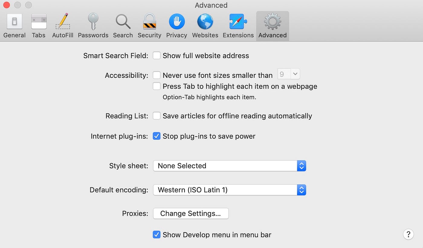
2. Ardından, geliştirmeyi yaptığınız bilgisayarınızda Safari’de geliştirici araçlarını da etkinleştirmelisiniz. Geliştirme bilgisayarınızda Safari’yi başlatın ve menü çubuğunda Safari > Preferences (Safari > Tercihler’e) gidin. Görüntülenen tercihler bölmesinde, Gelişmiş sekmesine tıklayın ve ardından alttaki Show Develop (Geliştirmeyi Göster) menü seçeneğini etkinleştirin. Bunu yaptıktan sonra tercihler bölmesini kapatabilirsiniz.
3. iOS cihazınızı geliştirici bilgisayarınıza bağlayın ve uygulamanızı veya safari başlatın.
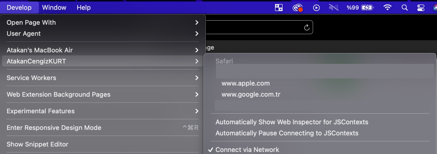
4. Geliştirici bilgisayarınızdaki Safari’de, menü çubuğunda Develop (Geliştir’e) tıklayın ve iOS cihazınızda çalışan webview örneklerinin bir listesini göstermek için iOS cihazınızın adını seçin.
5. Hatalarını ayıklamak istediğiniz web görünümü için açılır seçeneği tıklayın. Bu, web görünümünü incelemek için yeni bir Safari Web Denetçisi penceresi açacaktır.

Author: Atakan Cengiz Kurt
In this article, I will discuss the details and differences of using Build Types and Product Flavors in Android. Both structures provide many conveniences when creating Android applications. We can benefit from many points, from the icons of the applications to the production versions, and from special configurations for development mode to creating different variants of the application.
Build Types help us customize certain features used by Gradle when developing, building, and preparing signed versions of applications. They also make it easier for us to manage certain configurations that we will use. By default, two Build Types are defined in newly created Android projects: one is the debug mode, and the other is the release mode.
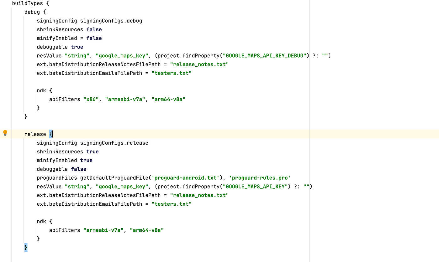
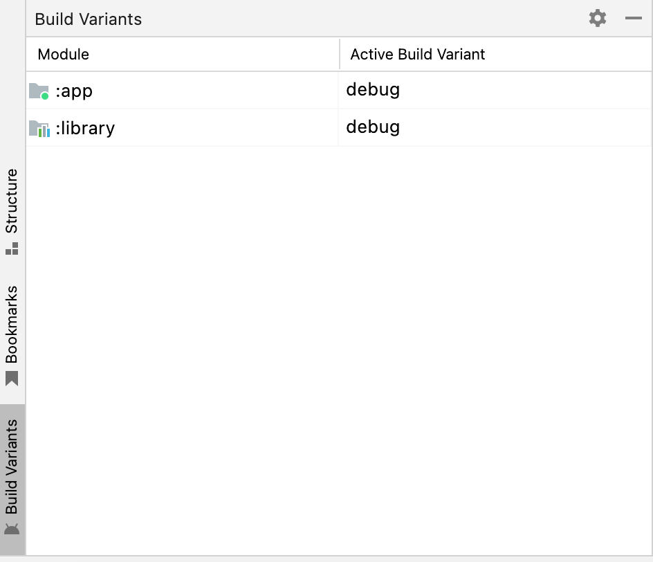
We can add a new type. Based on the types, we can add different version extensions or completely custom variables. During development, you can easily switch between these different types using the Build Variants tab located at the bottom left of Android Studio as a shortcut.
In the code example below, the MODE variable will be updated based on the selected type in the automatically created BuildConfig.java class after the code is compiled for the first time. You can easily access these static variables within code blocks. You can also apply your environment changes here. Thanks to this flexibility, you can set up a more secure and flexible development environment using special configurations for the development mode.
buildTypes {
    debug {
        signingConfig signingConfigs.debug
        shrinkResources false
        minifyEnabled = false
        debuggable true
        resValue "string", "google_maps_key", (project.findProperty("GOOGLE_MAPS_API_KEY_DEBUG") ?: "")
        buildConfigField "MODE", "DEBUG"
        ext.betaDistributionReleaseNotesFilePath = "release_notes.txt"
        ext.betaDistributionEmailsFilePath = "testers.txt"
        ndk {
            abiFilters "x86", "armeabi-v7a", "arm64-v8a"
        }
    }

    release {
        signingConfig signingConfigs.release
        shrinkResources true
        minifyEnabled true
        debuggable false
        proguardFiles getDefaultProguardFile('proguard-android.txt'), 'proguard-rules.pro'
        resValue "string", "google_maps_key", (project.findProperty("GOOGLE_MAPS_API_KEY") ?: "")
        buildConfigField "MODE", "PROD"
        ext.betaDistributionReleaseNotesFilePath = "release_notes.txt"
        ext.betaDistributionEmailsFilePath = "testers.txt"

        ndk {
            abiFilters "armeabi-v7a", "arm64-v8a"
        }
    }

    pilot {
        debuggable = true
        signingConfig signingConfigs.debug
        debuggable true
        resValue "string", "google_maps_key", (project.findProperty("GOOGLE_MAPS_API_KEY") ?: "")
        ext.betaDistributionReleaseNotesFilePath = "release_notes.txt"
        ext.betaDistributionEmailsFilePath = "testers.txt"
        buildConfigField "MODE", "PILOT"

        ndk {
            abiFilters "x86", "armeabi-v7a", "arm64-v8a"
        }
    }
}
Product Flavors is a structure similar to Build Types that provides flexibility. The main difference is that it allows us to generate different versions of the application from a shared codebase.
Android Product Flavors are used to create different versions of an app. These versions can have different features, such as being free or paid, having different themes and texts, or using different environments or APIs. For example, you want to create both a paid and a free version of the same app, with only minor differences between the two. Instead of using a separate codebase for each app, you can use the Product Flavors structure to create multiple versions using a shared codebase. With Product Flavors, you can easily manage many features of the app, from the name to the icon, version information to the API environment to be used.
flavorDimensions "env", "api"
productFlavors {
    prod {
        dimension "env"
        resValue "string", "app_name", '"Production"'
        manifestPlaceholders = [
            appIcon: "@mipmap/ic_launcher",
            appIconRound: "@mipmap/ic_launcher_round"
        ]

        applicationIdSuffix ".release"

        buildConfigField "String", "FLAVOR_TYPE", '"PRODUCTION"'
        buildConfigField "String", "DATABASE", '"PRODUCTION_DB"'
    }

    test {
        dimension "env"
        resValue "string", "app_name", '"Test"'
        manifestPlaceholders = [
            appIcon: "@mipmap/ic_launcher_test",
            appIconRound: "@mipmap/ic_launcher_test_round"
        ]

        applicationIdSuffix ".test"

        buildConfigField "String", "FLAVOR_TYPE", '"test"'
        buildConfigField "String", "DATABASE", '"TEST_DB"'
    }

    minApi28 {
        dimension "api"
        minSdkVersion 23
        versionCode 10000 + defaultConfig.versionCode
        versionNameSuffix "-minApi28"
    }

    minApi24 {
        dimension "api"
        minSdkVersion 21
        versionCode 10000 + defaultConfig.versionCode
        versionNameSuffix "-minApi24"
    }
}
I have a few points that I’d like to explain about the code block I shared above. Firstly, I have defined two dimensions with Flavor Dimensions: one is “env” and the other is “api”. With this feature, we can group based on these dimensions and use their combinations. That is, when we first compile the build.gradle by adding the code block above, the result of the combination between the “env” and “api” groups will appear in the Build Variants tab. You can see the output of this in the image below. For example, we get a new variant version by combining the test variant with the Minimum Api 24 variant. This way, we can make separate arrangements for APIs 24 and 28 with the same codebase, and distribute and manage them separately. We can make the names of the applications different from each other with “res_value” parameter. With “manifest placeholders” parameter, we can also use the application icons in different ways. Changing the app name with manifest placeholders is also possible.
Product Flavors structure also allows you to define custom variables in the same way as the Build Types structure. Similarly, you can access these static variables through the BuildConfig.java class
Author: Erdi Koç
Günümüzde kurumsal firmaların büyük bir çoğunluğu teknolojik alt yapısını bulut servislerine emanet etmiş durumda. Öyle ki, gelinen son noktada bulut servisleri On-Prime yapıların sağladığı tüm hizmetleri sağlar duruma geldi. Bununla beraber Bulut Sağlayıcı (Microsoft, Amazon, Google) firmaların girdiği rekabet dolayısıyla her geçen gün daha ekonomik seçeneklerle karşımıza çıkan bu servisler, kullanıcının sunulan hizmete ne kadar müdahale edebildiği veya ne kadar sorumlu olduğuna bağlı olarak 3 farklı kategoriye ayrılmış durumdadır.
Bunlar sırasıyla IaaS , PaaS ve SaaS olarak isimlendirilmektedir.

IaaS yani “Altyapı olarak hizmet” anlayışı, on-prime yapıların bir adım ötesi olarak düşünülebilir. On-prime sistemlerden farklı olarak, ağ(network), donanım, sanallaştırma gibi katmanlardan arındırılmış olarak doğrudan işletim sistemi seviyesinde hizmet sağlanır. Örnek olarak sanal makine kiralamak gösterilebilir. Bulut servislerindeki diğer hizmet türleri (Paas,Saas) ile karşılaştırıldığında, kullanıcıya en fazla yetki ve sorumluluğun tanımlandığı seçenek olduğunu söyleyebiliriz.
Iaas Hizmetlere Örnekler :
Kullanıcı sadece Uygulama ve Veri katmanından sorumludur. İşletim sistemi bazında herhangi bir sorumluluğunuz olmaz. Herhangi bir web veya mobil uygulamayı ayağa kaldırmak ve yönetmek için kullanılabilir. PaaS hizmetler genellikle yazılım geliştiriciler tarafından, uygulamaya daha fazla odaklanmak ve uygulamayı ayağa kaldırmak için gerekli olan alt yapı işlerinin yükünden kurtulmak için tercih edilir. Aşağıdaki servislerde genellikle web veya mobil tabanlı uygulamaların hızlı bir şekilde geliştirilmesi için gerekli ortamı sağlamaktadır.
Paas Hizmetlere Örnekler :
Hizmet olarak doğrudan uygulamanın sunulmasıdır. Genellikle uygulamaya tarayıcı üzerinden ulaşılır ve kullanıcılar çeşitli abonelik yöntemleri ile bu uygulamaları satın alır. Saas hizmet sağlayıcıları, uygulama ile ilgili tüm bakım, geliştirme ve güvenlik konularında sorumluluk sahibidir.
Saas Hizmetlere Örnekler :

IaaS,PaaS ve SaaS hizmet türleri, bulut teknolojilerindeki 3 ana kategori olarak adlandırılabilir ancak gelişen teknoloji ve değişen ihtiyaçlar neticesinde bu 3 hizmet türünden daha farklı seçenekler de doğmaya devam ediyor. Tüm bu gelişmelerden haberdar olmak ve incelemek için takipte kalın!
Görüşmek üzere!
Author: Deniz Alkan
Azure servisleri üzerinde SQL bir veri tabanına sahip olmanın 3 farklı seçeneği bulunmaktadır. Bu seçenekler, tam olarak ihtiyaç duyduğunuz hizmeti alma ve sadece aldığınız hizmet kadar ödeme yapma şansı sunmaktadır. Şimdi hep beraber Azure SQL dağıtım seçeneklerini inceleyelim.

SQL Sanal makineleri, kullanıcının SQL Server üzerinde en çok yetki ve sorumluluğa sahip olduğu seçenektir. Bu seçenekteki hizmet türü IASS (Infastructure as a Service) yani sadece alt yapı sağlayan bir hizmet türü olduğundan, Sanal makinedeki işletim sistemi güncellemeleri ve SQL Server üzerindeki güvenlik yamaları dışındaki tüm işlemler, kullanıcının sorumluluğundadır. Elbette bu sorumluluk kullanıcıya çok daha geniş bir yetki alanı tanımış oluyor. Öyle ki, SQL Server hizmetinin tamamını konfigure edebildiğiniz için SQL Veritabanı hizmetinin yanında SSAS, SSRS ve SSIS gibi yardımcı servislerinde kurulumu yaparak bu servisleri kullanabilirsiniz.
Türkçesi kulağa biraz garip geliyor olabilir. O yüzden biz İngilizce haline odaklanalım, Managed Instance! Bildiğiniz üzere SQL Server kurulumu yaparken birden fazla Instance oluşturabilirsiniz. Bir önceki seçenekte olduğu gibi sanal bir makine üzerinde SQL Server kurulumu yaparsanız birden fazla Instance’a sahip olabilirsiniz. Managed Instance seçeneğinde ise Azure sizlere SQL Server üzerinde kurulmuş bir adet Instance hizmeti sağlar. Bu servisin hizmet türü de PAAS (Platform as a Service) olarak adlandırılmaktadır. Yani alt yapıdan daha fazlasını sunan bir hizmet türüdür. SQL Server platformunu hizmet olarak sağlar. Bu durumda sorumluluğunuz daha az dolayısıyla hareket alanınız da daha kısıtlıdır. Managed Instance hizmeti ile SQL Server Agent, Machine Learning Services, CLR ve SSIS gibi servisleri kullanabilirsiniz.
SQL Veritabanı, kullanıcıları hem işletim sisteminden hem de SQL Server yapısından soyutlamaktadır. Bu seçenek size sadece SQL Veritabanı hizmeti sağlar. Instance bazında herhangi bir değişiklik veya kurulum yapma yetkiniz bulunmaz. Yetki alanının daha dar olmasına rağmen, SQL Veritabanı hizmeti, sınırsız depolama alanı ve otomatik ölçeklendirme gibi ihtiyaçları karşılayan tek dağıtım seçeneğidir. Ek olarak SQL Veritabanı servisinin de hizmet türü PAAS olarak sınıflandırılmaktadır.
Görüldüğü üzere her bir dağıtım seçeneğinin birbirine göre avantajlı veya dezavantajlı olduğu durumlar mevcut. Siz de ihtiyaçlarınıza en uygun dağıtımı seçerek Azure dünyasına adımınızı atabilirsiniz.
Bulut teknolojileri üzerinde kullandığımız servisler, sunulan hizmetin ne kadarının sistem tarafından, ne kadarının kullanıcı tarafından yönetildiğine bağlı olarak farklı kategorilere ayrılır. Bunlar sırasıyla IASS , PAAS ve SAAS olarak isimlendirilir.
Bu kategorileri detaylı incelemek için aşağıdaki yazıya göz atabilirsiniz.
Daha detaylı incelemeler için takipte kalın!
Görüşmek üzere!
Kaynakça :
Author: Deniz Alkan
There are several ways to style react app. Each one has its own pros and cons. In this article, I’ll show you ways of using stylings and what is the best option.
“If you tell yourself you can’t, you won’t.” -Dean Graziosi
I’ll mention primary ways to style a react app. There is a number one option in this, for me. When choosing a way, we must consider two crucial topics; Firstly every project has different needs. Secondly, developers; whose the main characters of the software. We should consider developers’ skillsets, the project’s future, etc. Long story short all these things should be evaluated wisely.
Let’s start.
— INLINE STYLING
This is the most basic option. It’s just like coding HTML. Styling elements inline doesn’t require you to create a separate stylesheet.
PROS 👍🏻
CONS 👎🏻
If the app will be very small maybe you can select, otherwise you shound’t select this option. I think.
— PLAIN CSS
This way is the most common approach. It’s easy to use and understandable. Write CSS in another file and import it to style a component’s element.
PROS 👍🏻
CONS 👎🏻
This option can be selectable. But if you define the project as big, skip this.
— SASS / SCSS
SASS is a preprocessor for CSS. Stylesheets are getting larger, more complex, and harder to maintain. This is where a preprocessor can help. Sass has features that don’t exist in CSS yet like nesting, mixins, inheritance, and other nifty goodies that help you write robust, maintainable CSS.
PROS 👍🏻
CONS 👎🏻
— CSS MODULES
This one is actually an alternative to the last two options (Css,scss). Everything is the same but by using this our CSS codes will be scoped.
It has a simple usage. Let’s say you have a file named Home.jsx, create another file here and give a name as Home.module.scss. And simply import this file to Home.jsx.
By using this our classnames will be unique.
Naming style: fileName_className__[unique_identifier]. Example:
<div class="Home_home__9Ke73">
PROS 👍🏻
CONS 👎🏻
For multiple and conditional classnames can be use classnames.
— CSS in JS
You can write CSS in the react file, like HTML. React made this possible. These codes will be scoped too, obviously.
Usage example:
import styled from "styled-components";

const Button = styled.button`
  color: limegreen;
  border: 2px solid limegreen;
  margin: 1em;
  padding: 0.25em 1em;
  border-radius: 3px;
`;
PROS 👍🏻
CONS 👎🏻
— USING A THIRD-PARTY LIBRARY
There are many CSS libraries and pre-made components out there. Like tailwind, bootstrap, chakraUI, and materialUI. Using there may be easier compared to others.
PROS 👍🏻
CONS 👎🏻
What am I using?
I usually use CSS modules with SCSS. Because this meets all my requests, easy and common.
Firstly I’m creating a styles folder in assets and creating global files in it like animations, global, mixins, and variables. After that, I combine these in main.scss file and in index.css refer it with import.
By the way, I have a folder structure article. If you wanna read, you can simply click the following link.
And every other file has a .module.scss file. This way I kept the advantages of multiple options.
I mentioned nearly every possible way to style react app. Every option has pros and cons. Choosing may be tough. But like I said before, must be evaluated wisely.
I hope this guide helps you.
Author: Mahir Uslu
İlk paylaşımım olan bu yazımda React’ın memoization hooklarından useMemo ve useCallback’i ele almak istedim. Birçok kişide kafa karışıklığına neden olan, nerede ve nasıl kullanılması gerektiğinden emin olunamayan bu hookları örnekleri ile birlikte açıklayacağım.

Eğer orta veya büyük ölçekli React projelerinde görev alıyorsanız bu hooklar ile büyük ihtimalle karşılaşmışsınızdır. Hatta tam olarak işlevlerini bilmeden projede kullanılıyor diye kullanmış da olabilirsiniz fakat bu kullanımların çoğunun gereksiz ve memory leak’lere neden olduğunu söylemem gerekir. Lafı daha fazla uzatmadan useMemo ile useCallback’ten ve asıl kullanım amaçlarından bahsedelim.
Memory Leak: Kodların kullanmış olduğu hafıza bloğu ile işinin sona ermesine rağmen o hafıza bloğunu bırakmamasına denir.
Örnekte de gözüktüğü şekilde useMemo, bir “create” fonksiyonu ile dependency array (bağımlı değişkenler dizisi) alır ve bir memoized value (hafızaya alınmış değer) dönüşü yapar. Örnekteki isimlendirmelerle devam edecek olursak memoizedValue değişkeni, dependency array içerisindeki a veya b değerleri değişmediği sürece aynı değeri hafızada tutacaktır. Eğer a veya b değerlerinden en az birisi değişirse “create” fonksiyonu çalışıp yeni bir değer dönüşü yapacaktır. Hesaplanması zaman alabilecek ve performans sorunlarına neden olacak değerleri hesaplamak için kullanılır (computationally expensive calculations).
useCallback ise argüman olarak inline callback ile dependency array alır ve dönüş değeri olarak da memoized callback (hafızaya alınmış callback fonksiyonu) dönüşü yapar. useMemo’da da olduğu gibi memoizedCallback değişkeninin tutuğu callback sadece dependency array içerisindeki a veya b değişkenleri değiştiği zaman değişir. Ayrıca useCallback, gereksiz render etme işlemlerini önlemek için reference equality yöntemine göre optimize edilmiş alt componentlere callback fonksiyonu geçerken işimize yarar.
useMemo ve useCallback gibi memoization hooklarını kullanmak maliyet doğurabilir. Bu yüzden gerçekten ihtiyaç duyulan noktalarda sorumluluk alınarak kullanılması gerekmektedir.
JavaScript dilinde abstract equality (==) ve strict equality (===) olarak iki çeşit eşitlik operatörü vardır. React ise genellikle Object.is(object1, object2) eşitlik kontrolünü kullanır fakat çok detaya girmeden bu yapı ile strict equality’nin oldukça benzer olduğunu söyleyebiliriz.
React’ta referential equalty’nin önemli olduğu 2 durum vardır. Bunlardan biri dependency array diğeri ise React.memo’dur.
Dependency Array
React’ta ki bazı hooklar, yapısında dependency array bulundurur. Bunlardan en bilindikleri ise useEffect, useMemo ve useCallback şeklinde sıralanabilir. useEffect üzerinden örnekler ile devam edecek olursak (örnekler anlaşılır olması için basit tutulmuştur):
Yukarıdaki örnekte firstProp ile secondProp değiştiğinde useEffect’in tetiklenmesi amaçlanıp functionA’nın tekrar çalıştırılması beklenmektedir. Fakat JavaScript’in çalışma mantığı nedeniyle propObject her render sonrasında yenilenecektir. Bu nedenle de React, useEffect’in dependency array’inde bulunan değişkenin değiştiğini düşünüp firstProp ve secondProp değişmemiş olsa da useEffect’i çalıştıracaktır. Bu yüzden istenmeyen durumlar oluşabilmektedir ve iki farklı şekilde bu durumu düzeltmemiz mümkündür.
Bunlardan ilki ve mümkünse uygulanmasını tavsiye edeceğim çözüm yolu şu şekildedir.
Fakat bazı durumlarda geçtiğimiz proplar primitive (string, number vb.) olmayabilir. Yani function, object veya array gibi tiplere sahip olduklarında useMemo veya useCallback kullanarak yukarıda bahsettiğimiz sorunu düzeltebiliriz.
Bu kullanım şekli de aslında useMemo ve useCallback hooklarının ortaya çıkış nedenini göstermektedir.
React.memo
Yine bir örnek üzerinden ilerleyecek olursak:
Örnekte de gözüktüğü üzere Counter komponentimiz, Button adlarında iki adet komponent barındırmaktadır. Button komponentlerinden birine her tıkladığımızda Counter komponenti içerisindeki statelerden biri değişeceği için her iki Button komponenti de render edilecektir. Tıklamış olduğumuz yani değerinin değişmesini istediğimiz Button komponentinin içerisinde güncel count değerine ulaşacağımız için bu komponentin render olması bize bir sorun teşkil etmezken diğer Button komponenti gereksiz bir şekilde tekrar render edilecektir. Bu sorunu düzeltmek için Button komponentini React.memo ile sarmalamamız gerekmektedir.
React.memo(component, areEqual) aslında bir high order component’dir (üst katman bileşeni) ve gözüktüğü şekilde 2 adet argüman alır. İlk argüman sarmalamak istediğimiz komponent olurken ikinci argümanı ise kullanılması zorunlu olmayan özel karşılaştırma (areEqual) fonksiyonudur. Ayrıca React.memo normalde yüzeysel olarak (shallowly compare) komponent içerisindeki propları karşılaştırıp render işlemine karar verirken areEqual fonksiyonu sayesinde karşılaştırma işlemini özelleştirebiliriz. Detaylı bilgi için…
Yukarıdaki şekilde sarmaladıktan sonra Button komponenti React.memo sayesinde sadece propları değiştiği zaman tekrar render edilecektir. Tam da burada küçük bir noktayı daha düzeltmemiz gerekiyor çünkü Button komponentinin proplarından onClick’e verilen değişkenler non-primitive (function, object vb.) tipte olduğu için state değişiminden sonra yeniden oluşturulacaklar ve gereksiz render etme işlemini önleyememiş olacağız. Bu durumu düzeltmek için de devreye useCallback’i giriyor (duruma göre useMemo da kullanılabilir).
Yaptığımız bu değişiklik ile gereksiz render etme işlemini önlemiş oluyor ve React.memo’yu sağlıklı bir şekilde kullanmış oluyoruz.
React.memo optimizasyonu bir maliyet doğurabileceğinden dolayı kullanımına karar vermeden önce emin olmalıyız ve doğru bir şekilde kullanmalıyız. Ayrıca React’ın hızlı çalışma yapısı sayesinde ciddi sorunlar çıkarmayan gereksiz render işlemleri göz ardı edilebilir.
Maliyet doğurabilecek hesaplamaları useMemo içerisinde yapmak bize performans sağlayacaktır. useMemo’nun asıl ortaya çıkış amacı da bu tarz maliyetli işlemleri gereksiz tekrarlardan sakınmak içindir. Yine bir örnek verecek olursak (tam olarak kullanışlı bir senaryo olmasa da anlaşılır olmasını amaçladığım bir örnek):
Yukarıdaki kod satırlarında gözüktüğü şekilde olası render işlemlerinde calculatePrimes tekrar tekrar çalışacaktır ve asal sayıların hesaplanmasının maliyet oluşturacağını varsayarsak projemize ciddi bir yük olacaktır.
Bu şekilde useMemo ile sarmaladığımızda sadece dependency array içerisindeki değerlerin değişmesi durumda hesaplanacaktır. Yani gereksiz render işlemlerinde hesaplama yapmayıp hafızadaki hesaplanmış değeri döndürecektir.
useMemo ve useCallback hooklarının kullanımı performans sağlayabilirken maliyetinin de olabileceğini tekrar vurgulamak istiyorum. Özellikle aynı proje üzerinde çalıştığınız arkadaşlarınız için karışıklık doğurabilir ya da dependency array’de yapacağınız yanlışlık ile memoize edilmiş değerlerin garbage collector tarafından temizlenmesini engelleyerek performans sorunlarına neden olabilirsiniz. Eğer ölçümlerinizi ve kullanımınızı doğru yaparsanız başta da söylediğim gibi performans faydaları sağlayabilirsiniz.
Umarım faydalı bir yazı olmuştur 🙂
Author: Mehmet Mutlu